Published as:
Super Graphic
Interior Design: Raji RM & Associates
Text: Carolyn Horwitz
Photography: Rikki Snyder
Work backward—that’s what Raji Radhakrishnan had to do when she signed on to redecorate a contemporary home in Arlington, Virginia, for a peripatetic art-collecting couple and their teenage daughter. This was no ordinary assignment for the designer, who works out of Washington, D.C., and New York under the sobriquet Raji RM. The clients—he is British, she is Russian—had traveled the world, amassing wonderful objects for their home: African masks, Cambodian sculpture, European furniture, rugs, paintings, you name it, so many things, and all of them in the wrong place.
It was “just madness,” says Raji, who—with an international upbringing in India and beyond, vast knowledge of art, and freedom from constraints—was clearly the right person for the job. “It was very different from my other projects, where we buy everything,” she says. “Usually we have clients who have nothing, or they don’t want to use anything from their previous homes, and we do everything from scratch, right down to the cup and saucer.”
Instead, this job was all about removal, the creation of negative space. “My biggest challenge, whether they said it or not, was to eliminate all the unwanted. Edit, edit, edit—that was the key. And then, once I had determined the right pieces to be in that home, it was a big matter of reshuffling them from floor to floor, from room to room, and putting them in the right place.” She spent a month cataloging the collection and reframing more than 100 paintings before deciding what to put where and what gaps (there were a few, despite the vast number of furnishings) needed to be filled with new purchases.
When it came time for installation, she had an idea. “I wanted it to be a very artful house—a home that’s relaxed and enjoyable for the family,” she says. “But I also wanted to really give importance to the art, and make it like an art installation, the entire home. I’m talking about an art installation the way an artist would do it. If it was an artist’s home, how would he or she do it? That was my perspective.”
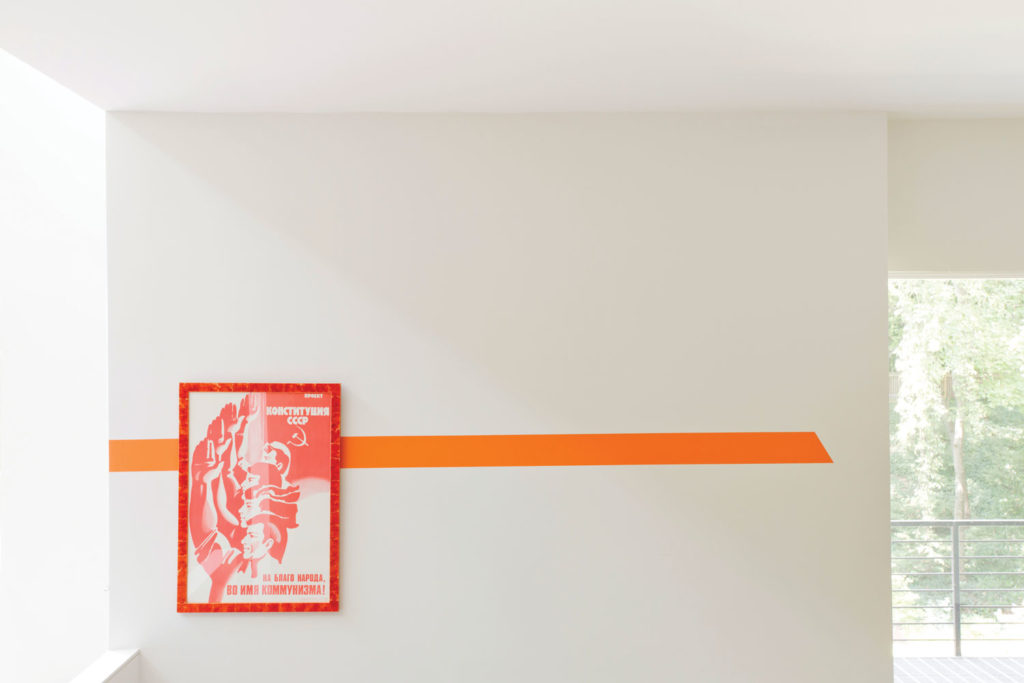
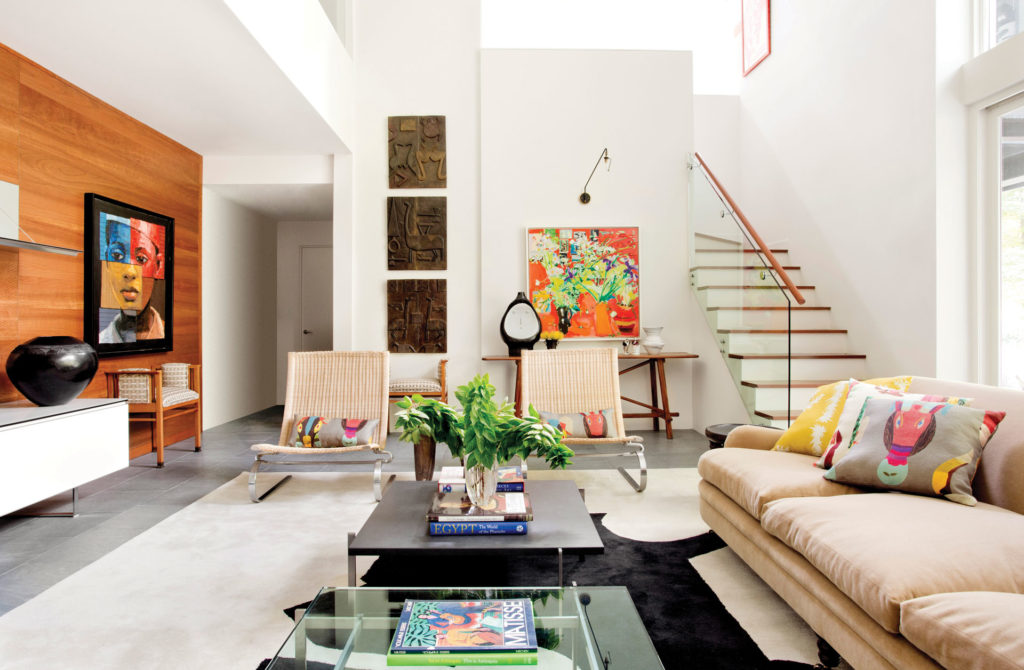
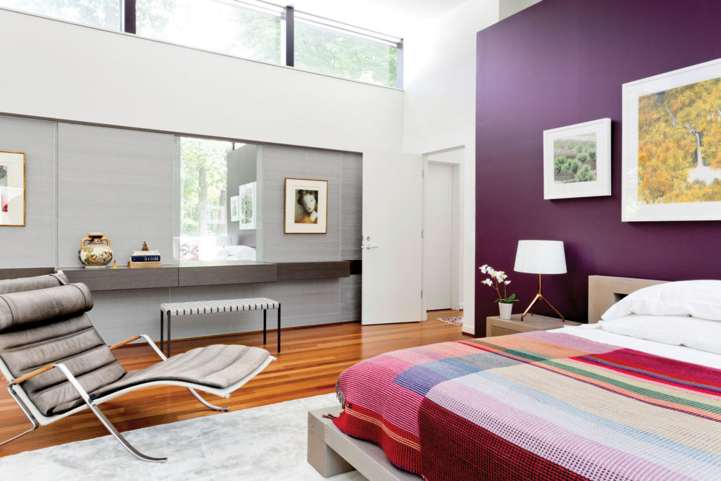
On the spot, she devised minimalist wall art—clean, modern, not dissimilar to the famous supergraphics created by Barbara Stauffacher Solomon in the 1960s for the Sea Ranch community in northern California. Raji’s paint strokes would interact with the clients’ pieces, bringing them new life. The first graphic appears in the foyer, where there’s a wall of blue with bright white shapes that appear vaguely typographical but were, in fact, inspired by the monumental sculpture of Richard Serra. A painted door animates the graphic when opened or closed. From the foyer, a hallway picks up that blue in the form of a diagonal stripe that shifts to black as it moves up the wall and partway across the ceiling. The thrust of this graphic directs you to the living room, where the black paint reappears as rays emerging from the corners of a small, vivid painting hung over a Danish oak credenza.
Restraint was key. Opposite the black graphic, she chose to highlight a collection of quiet works by Henry Moore. “Because they are very pale charcoal drawings and not one of those loud kind of paintings, I didn’t feel like doing any paintwork around them, because I didn’t want to undermine their beauty. So I left the wall clear and simple, just the white paint that was there, but I rearranged the artwork in such a way that it danced on its own.” Alone to the left she hung a work by Salvador Dalí. “The reason I did that was to try and give it an animated feeling, a bouncing effect; everything is kind of moving around, leading one to the other,” she says. (Raji was trained in classical Indian dance, and her design vocabulary is imbued with movement.)
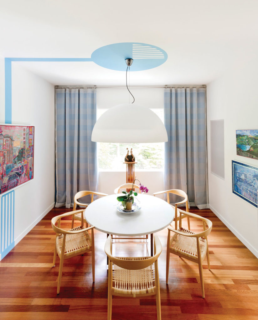
The living room’s furnishings, including the antique Continental cane chairs and vintage leather sofa, were almost entirely the clients’ own, “sourced” from other parts of the house. Three or four steps down is the dining room, whose ceiling can be seen from the living room. Raji painted her next graphic there, a bit of pop art à la Roy Lichtenstein, in a circle that echoes the shapes of the Vico Magistretti pendant lamp, Poul Kjaerholm table and Hans Wegner chairs.
The family room needed new, comfortable seating. Raji bought a creamy sofa from George Smith and injected color with cushions covered in Pierre Frey’s textiles inspired by the art of Jean Lurçat. On the floor, she placed the Prado rug from her own line—all her rugs are named for museums and informed by artists such as Serra and Eduardo Chillida—whose amoebic black form grounds the room, while the beige backdrop leaves plenty of negative space. Atop it, the clients’ Kjaerholm PK61 coffee tables—one glass-topped, one slate; yin and yang. On the stairwell and hallway to the master bedroom, more linear graphics. What was an uncomfortable museum has become a functional and relaxed family home. Ultimately, Raji says, “the amount of clarity that we created, and the amount of breathable air that we created, was much more important than what we filled it up with.” Raji RM & Associates, rajirm.com