THE HOUSE THAT
ART BUILT
Interior Design: Stan Topol & associates
Text: Erika Heet
Photography: Nathan Kirkman
When Atlanta-based designer Stan Topol’s repeat clients
asked him to accompany them on a journey through their favorite neighborhoods in the Mid-South to help them find their new home, he happily obliged. “They took me on a ride to look at different houses,” remembers Topol. “Every time they showed me a house, I said, ‘I could make this work,’ but then one day they drove me by this little long, narrow lot. They couldn’t decide what to do, so they asked me what I would do. I said ‘Buy the lot.’” So they did.
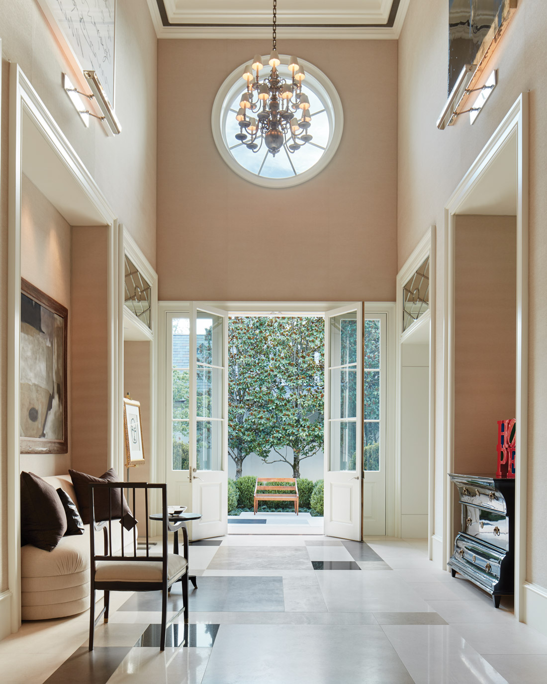
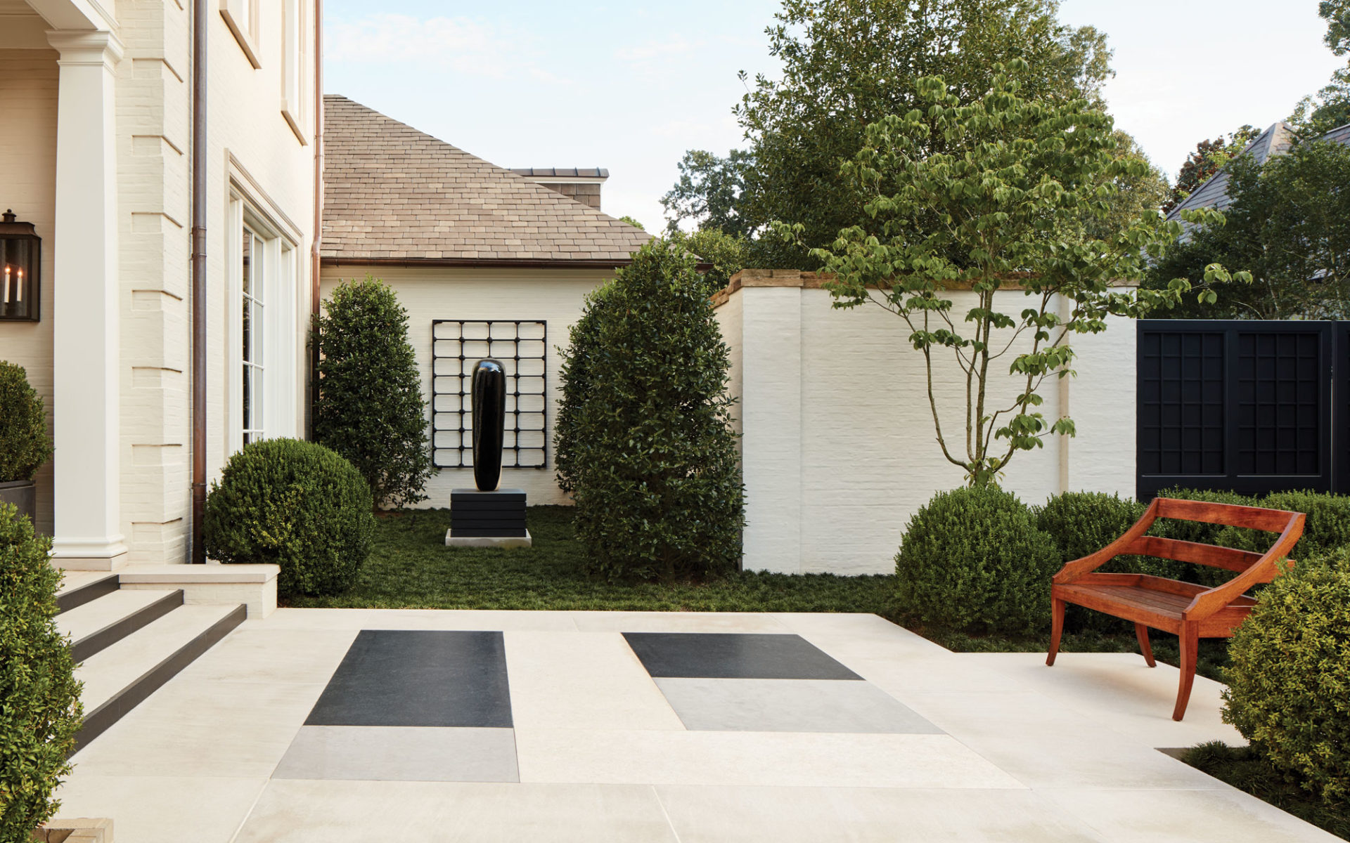
Their first question to Topol—who assisted the revered New York decorator Billy Baldwin before venturing out on his own in the mid-1970s—was how he was going to fit a house on this awkwardly shaped lot. His solution was simple. “I like houses that don’t face the street,” says Topol, with whom the couple, for whom privacy was very important, agreed. “And one of the things I’ve learned from my own house is if you enter from the side, you get more of a house.” He and team designer Doyle Garland drew up a plan, the couple signed off, and the time came to find an architect. They called upon Lewis Graeber III, based in Jackson, Mississippi, who helped articulate a layout in which the residents would pass through two elegant courtyards before reaching a pair of French doors leading into a glorious double-height foyer designed to fill with pieces from their incredible collection of modern art. The artful approach begins outside, where a sculpture by Jun Kaneko grounds the entrance courtyard. Underfoot, mixed stone slab pavers from François & Co. in hues ranging from white to slate gray to jet black are arranged in what Topol refers to as a “Mondrian pattern” that continues into the foyer, its stunning details finished by Garland.
To balance the drama of the art collection—which includes works by Cy Twombly, Helen Frankenthaler, Ed Ruscha, Alexander Calder and Louise Nevelson—Topol introduced a mélange of antiques and chic furnishings. Where it was necessary to customize furniture, Topol, with designer Cynthia Badalamente, called upon experts like Sally Sirkin Lewis of J. Robert Scott and Rose Tarlow Melrose House to specify pieces to his exacting standards. (Topol points out the “delicious” custom benches by the latter in the courtyard.) In an extraordinary display of adaptation, Topol measured his clients’ feet when planning the main stairway. “Nothing’s worse than not having a step you feel safe on,” he notes. That stairway has the benefit of a single standout accompaniment: a bold red, white and black tapestry by Alexander Calder whose sweeping gestures mirror, or rather informed, those of the stair rail. “We built the staircase for it,” says Topol, who found the tapestry and many of the home’s prized works at Rafael Gallery in New York. “When people do houses, if you start shopping before you build, you know where you can put things. I had a client in Florida who once said, ‘Buy everything first, then start the drawings.’” Topol took Graeber’s initial idea for the balustrade, flipped it upside down, “then simplified and simplified” until the little nickel metal detail, and the perceived “weight,” were at the top. “It really works,” says Topol.
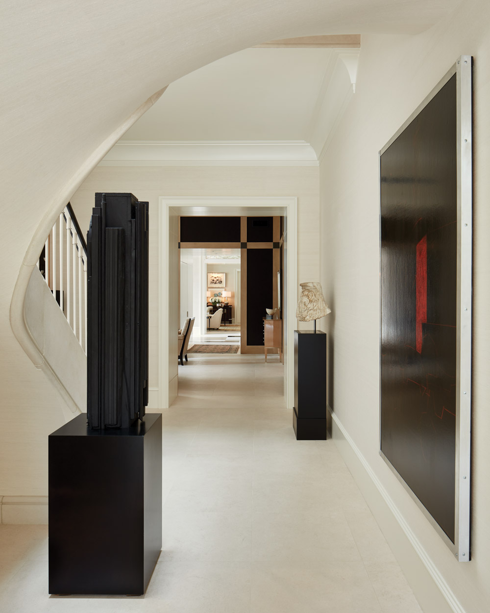
 Topol treated all the art throughout the house similarly, clearing the way for each work to stand on its own (expertly lit by Garland), but allowing each to meld brilliantly with others. “What I learned from Billy is ‘negative space,’” Topol says. “It’s not what you hang but what you don’t hang around it. Most people don’t think in terms of negative space.” This is especially effective in the main hall, where a black wood sculpture by Louise Nevelson stands with a large abstract painting by Anthony White and a 3rd century Roman marble lion’s head sculptural fragment. The house follows a similar rhythm throughout: In the living room, seating groups gather around Heaven, a piece by Ed Ruscha, over the fireplace. Nearby, a colorful abstract painting by Helen Frankenthaler hangs with pieces from J. Robert Scott and Bernd Goeckler. More J. Robert Scott chairs—sized specifically for the host and hostess—decorate the dining room, where Joan Mitchell drawings join a chevron stencil by Kenneth Noland. Of the works, respectively, Topol says: “It was time for a Joan Mitchell experience,” and “The Noland is an homage to Paige [Rense], who was married to Kenneth and who was very generous to me when she ran AD. Plus, I’m in love with the piece and we wanted to add color to the room.” In one corner, a Coromandel screen that was once part of a group that famously lined the walls of Coco Chanel’s Paris apartment adds depth and texture. With this screen comes one of Topol’s delightful stories. “Harry Hinson called me to New York and said, ‘You have to come to my warehouse,’” Topol remembers. “So I went because he told me to. There, he said, ‘I want you to see something. There’s a screen that came out of Coco Chanel’s home.’ When he got something special in, he would always call me.”
Where art was not a focal point in the rooms, Topol and Badalamente allowed the furnishings to take over, such as the screen porch’s custom mirror from Dennis Leen, its geometric corners mirroring the treatment on the walls of the study. In the kitchen, the London chandelier from Fuse Lighting adds moodiness, joining barstools from John Boone covered in fabric from Jean de Merry. For Topol, sources are not just sources, they are “good friends,” and every last detail has a story. This house is a result of those stories. It is also the reflection of a storied career, which took Topol from being what he refers to as “the end of the Baldwin boys” to a highly respected designer in his own right. It is the stories that are carried into the home by each artwork. But it is above all a love story—the tale of a life together. “What I finished,” says Topol, “was the dream of this couple.” Stan Topol & Associates, stantopol.com
Save
Save
Save


