Published as:
Above Manhattan
Interior Design: Powell & Bonnell
Text: Jeff Turrentine
Photography: John Bessler

The Toronto-based interior design firm Powell & Bonnell has been creating stylish, bespoke spaces for the last 30 years; principal designer Albert Limshue has been there for 15 of them. Over that time he’s developed close relationships with dozens of clients who value the firm’s commitment to crafting designs that reflect their needs and sensibilities, eschewing faddishness and embracing flexibility—tenets that principals David Powell and Fenwick Bonnell have always embraced. When one pair of longtime clients purchased a Manhattan apartment recently, they turned to the firm that had already guided them through renovations of two other homes to help them make the most out of a small space at the top of one of the city’s best-known buildings: a grand, double-spired Art Deco landmark on Central Park West.
Fortunately, Limshue already knew them well enough to know not just what they liked, but how they lived. Trust, by this point, was implicit. “They didn’t really live in the space before we got our hands on it,” Limshue says. “There was a blow-up mattress and a blow-up lounge chair in the living room—that was it. They just said, ‘We need your help.’ ” That much was clear. Somewhat less clear was how the team would overcome two significant obstacles to turning this top-floor tabula rasa into an elegant pied-à-terre: the fact that the apartment was only 750 square feet, and the fact that fully reimagining an apartment of any size in a landmark building is a task so exacting that Limshue has likened it to arthroscopic surgery. “You have to make everything just right, but without touching anything above or below,” he says. “A renovation at any time is difficult, but a renovation in a historic New York apartment—with New Yorkers as your neighbors—is extremely difficult. In order to remove plumbing or do anything structural, you have to do it without interrupting anybody else.”
Since the project called for adding a bathroom and completely reconfiguring the kitchen, Limshue—working closely with the architect James Dixon, whose experience with landmark New York buildings made things go much more smoothly and swiftly—“had to be creative.” Creativity, of course, flourishes under limitations. The apartment’s petite dimensions meant that the team would have to think more like an editor than a curator, lest the result feel cluttered and chaotic. (Early on in the project, Limshue says, the wife had drawn a line in the sand: “She said, ‘I love New York, but New York is so busy. This apartment has to be calm.’ ”)
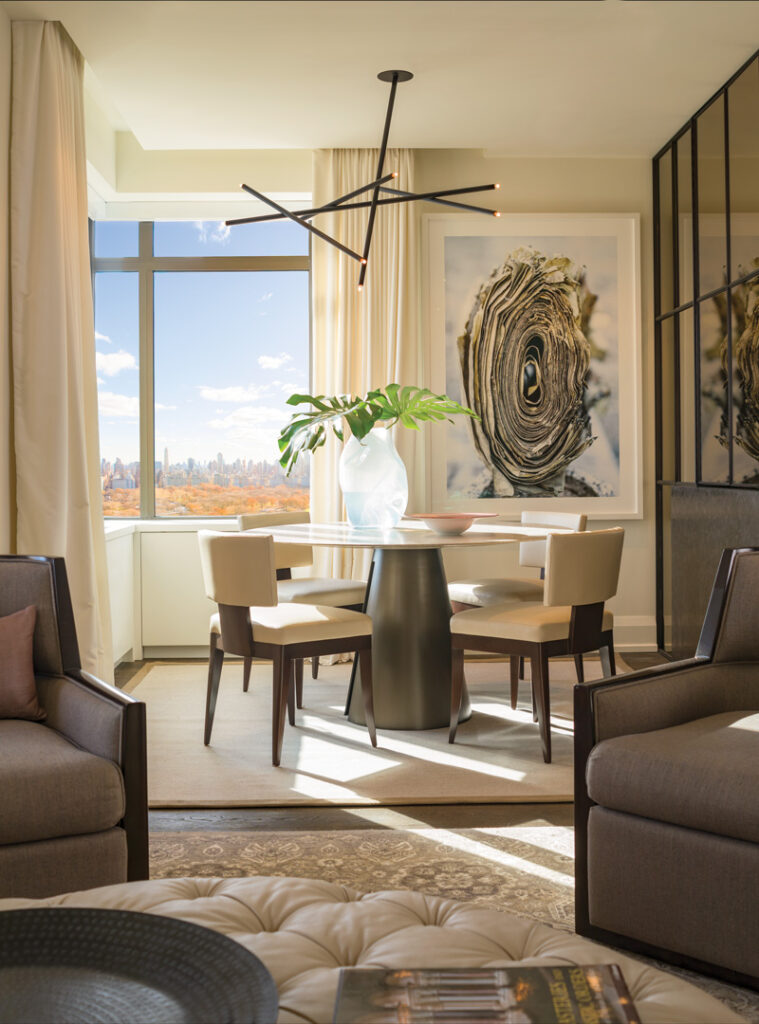
The solution: an eye-soothing palette built around beige, brown and cream, and a family of customized, multifunctional furnishings. In a living room that’s also called into service as a guest room, the Avery Boardman sofa is also a pull-out bed; the custom Powell & Bonnell tufted ottoman in front of it can be used alternately as a footrest, seating or a table. Between the windows is a lacquered cabinet, also custom from the designers, concealing a flat-screen TV that rises or falls at the push of a button, depending on which member of the household has prevailed. (“He loves television, and always wants it on,” says Limshue, whereas “she says she never wants to see the TV on at all.”) A pair of wood-framed and upholstered lounge chairs, from Powell & Bonnell’s Galileo line, swivel—a “priceless” convenience in a space so tight, Limshue adds. “Turn them one way to watch TV; turn them a little more for an amazing view of the park; turn them again to face the dining room, if you have guests.” Above the sofa, in a frame, is the chromatic inspiration for this room and perhaps the entire apartment: a vintage Japanese coat made from cocoa-colored paper, of all things, that somehow manages to evoke both rusticity and delicacy. The palette continues in the adjacent dining room, where a close-up photograph of a Torah scroll by Yuri Dojc joins a round dining table and city-sleek chairs, all from Powell & Bonnell.

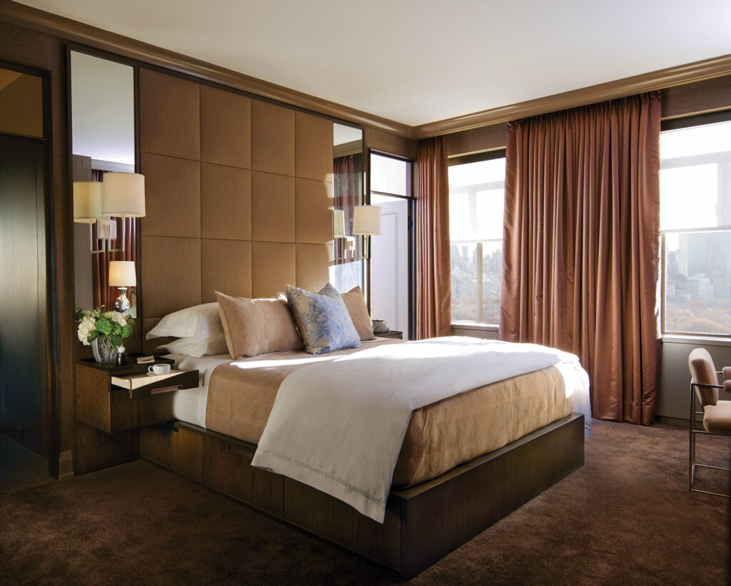
Most of the ottomans that Powell & Bonnell design, by the way, are square or rectangular; this one was made round, Limshue says, so that it could be easily tipped on its side and rolled out to the foyer whenever guests sleep over. That same economizing impulse was at work in the bedroom, where the specific configuration of windows and closets meant that wall space was at a premium. “A freestanding headboard or set of tables would have eaten up a ton of space,” says Limshue. The custom built-in headboard, a grid of upholstered tiles the shade of café con leche, rises from behind the bed to meet the ceiling; flanking it are narrow mirrors that reflect the ample light flowing into the room from 30 stories above Central Park. Nightstands, also custom, are attached to the wall as well, “so you don’t have to worry about stubbing your toes in the middle of the night.” More significantly, from a space-saving perspective, their lack of a footprint allows for drawers that have been built into the base of the bed to run its full length.
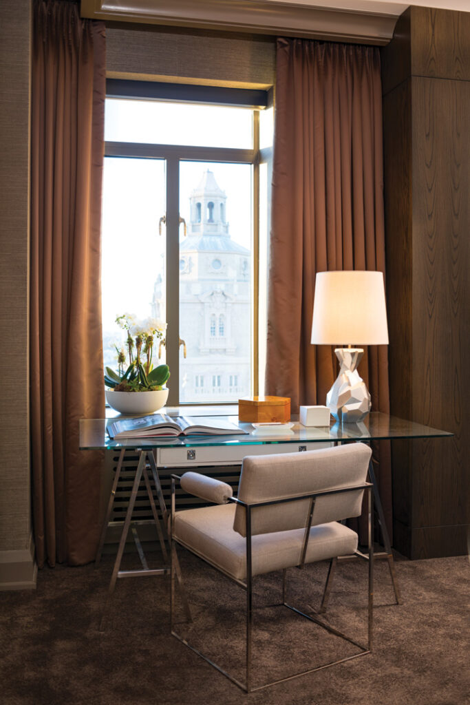
Offsetting the richness of the room’s deep browns is a glass-topped vintage Milo Baughman desk, paired with a Baughman chrome chair, with a cream-colored seat and padded arms, that was originally designed for Thayer Coggin in the late 1960s. The wife made clear that she would be working at this desk, but with all of the dark wood and chocolate tones surrounding it, “we didn’t want it to feel heavy,” Limshue says. “It couldn’t be a regular office desk. The glass top was ideal.”
For Powell & Bonnell, renovating an apartment of this size represented an opportunity to distill their design philosophy down to its fundamentals: color, form and scale. Every square foot counted; every inch of wall space was precious. Elegance was the goal, even though extravagance was impossible. It wasn’t easy—but you’d never know that from the sense of ease you feel when you walk through the door. Powell & Bonnell, powellandbonnell.com


