SHIP SHAPE
Architecture: Grant Kirkpatrick/KAA Design
Interior Design: Douglas Durkin
Text: Erika Heet
Photography: Manolo Langis
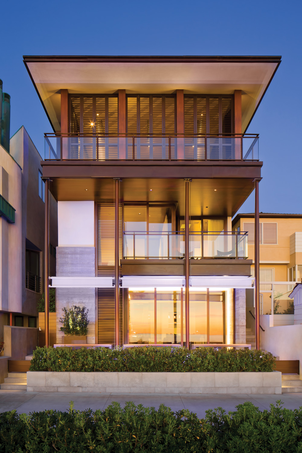
The highly coveted yet incredibly skinny lots along the Strand in Manhattan Beach, California, continue to push architects and builders to devise ways to fill that precious space in a balanced, meaningful way. One of those architects, Grant Kirkpatrick, founding partner of KAA Design, has been rising to the occasion for more than 30 years. His most recent charge was to create a house for an adventurous couple—both sailors, both of whom have captained ships—who welcomed three young boys in the process, so the design would need to be well planned, yet fluid enough to shift with the family’s needs. “Each project is a new challenge,” Kirkpatrick says. “These Strand lots are typically about 30 feet wide, that’s it, so the homes end up being about 24 feet wide. I think of the floors like railroad cars stacked up on each other. In a lot of ways these homes are like ships—in fact, I call this the Armani ship docked at the beach.”
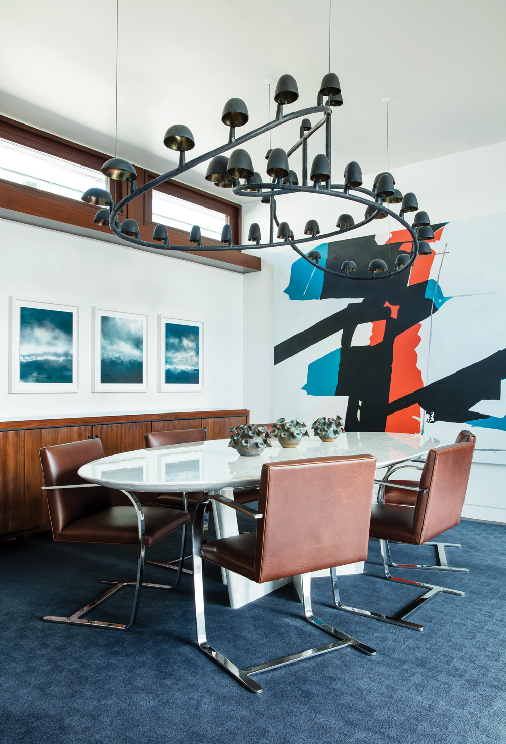
For this fashion-forward ship, Kirkpatrick carved out four floors: A basement level with a gym, theater and wine room; a beach-level bar and entertaining space with guest rooms and a spa; the entry level, fronted by the master suite; and an open, top floor living area with a dining room, kitchen, terrace, and bedrooms for the children. “We inverted the plan so the living level is the top level, sort of like penthouse living,” Kirkpatrick says. “They live upstairs graciously in an indoor/outdoor way.” Spanning the floors is a gorgeous and space-saving mahogany central spiral stair that reads as a sculpture from above and below. On a wall nearby, ceramic wall sculptures by Maren Kloppmann resemble whale tails with midcentury lines, bringing in a certain modernity. That stair curve is echoed in the bronze pendant light sculpture by Frederik Molenschot in the upstairs dining room, its sweeping lines tempered by Mies van der Rohe Brno chairs, a photographic triptych by Santeri Tuori and a colorful, graphic painting by Koen van den Broek.
 The seamless blending of architecture and art, along with the elegant mix of vintage and custom pieces, is the work of designer Douglas Durkin, who worked with the architect and the clients from the start, resulting in the smooth harmony throughout. “Grant’s concept of the building echoing a ship was brilliant, as was his arrangement of the rooms and floors from
the top down, and in the use of simple and clean materials that worked their way through the spaces,” Durkin says. And, as in a fine yacht, “Mahogany was the driving concept from the start, as it was the key material on the building’s exterior, windows and doors.”
Mahogany protects the street-side facade like armor, and accents the beach side for continuity. Its darkness is balanced by the lightness of the master bedroom, the modest footprint encapsulating a very welcome trend in bedrooms: quality over quantity. This small space simply favors the ocean views beyond with floor-to-ceiling glass and envelops the couple with oyster-hued draperies from Clarence House, white Hervé van der Straeten Patmos lamps and crisp white Italian bedding from E. Braun & Co. New York. “Most of our clients don’t want a big bedroom with a large furniture arrangement,” Kirkpatrick notes. “They want it to be comfortable and quiet and they always ask for blackout shades.”
Directly upstairs, the long and linear main room has a distinct rhythm of seating groups for casual dining, lounging and reading (the couple’s library is filled with books on design, architecture, travel and culture). “The clients love blue, so that was the one color we used throughout to play off the bone-colored walls and the mahogany detailing,” Durkin says. “Large-scale furnishings were kept very clean and the color palette reduced and consistent throughout the house, which allowed for the wow factor of the artwork and the views of the ocean to capture the eye.” Franco Albini chairs from Cassina are dressed in a blue leather with hints of slate and gunmental so as not to be too matchy- matchy with the ocean, and the Leonardo Drew piece above the fireplace adds 3-D texture and still more contrast.
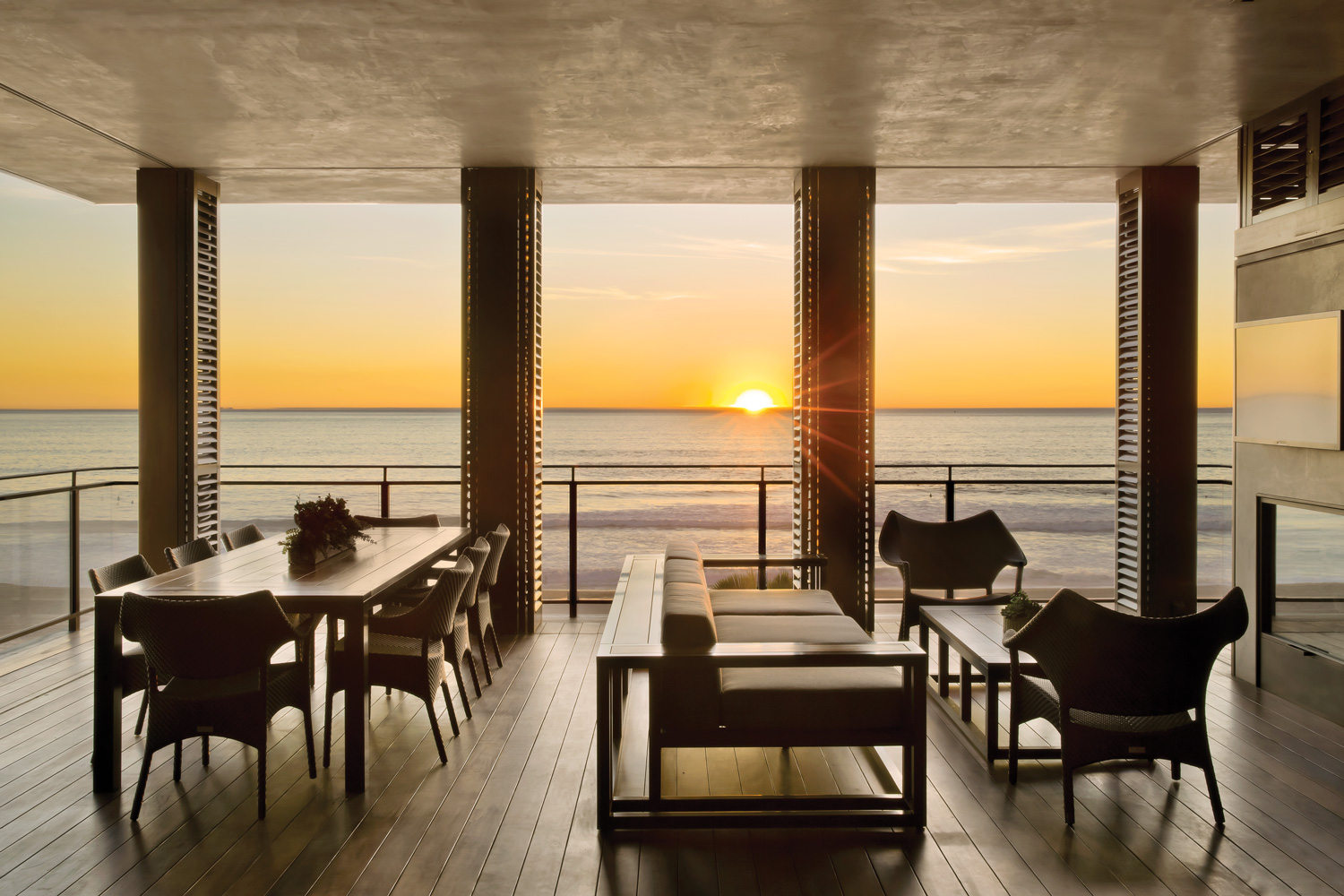
Whereas it might have been tempting for one to fill this beachside lot with a boxy rectangle, Kirkpatrick’s approach is more honed and subtle. As it rises from the sand, the house steps back farther with each floor—it abuts the Strand at the beach level, retracts and tucks in at the master suite above, then retreats even more dramatically at the top level to make way for the generous entertaining deck on the top floor, lined by louvered screens to help temper sun and wind. “It’s our version of a superyacht beach club,” says Kirkpatrick, who integrated a kitchen and fireplace into the space, near which Durkin placed a custom sofa paired with pieces by David Sutherland and Janus et Cie. “This is the room that they enjoy the most and they spend a lot of time here,” Kirkpatrick says. It’s an understandable gravitation. KAA Design Group, kaadesigngroup.com; Douglas Durkin Design, durkindesign.com
Save
Save
Save


