 Two decades passed before the Viceroy L’Ermitage Beverly Hills
—a low-key, high-design hotel whose glamorous history remains subtly infused into its décor—received a much-needed refresh courtesy of the local firm Smith-Firestone Associates (SFA). “They interviewed almost every designer in town—and in New York,” notes principal Kara Smith, president of SFA, founded by partner Sue Firestone more than 20 years ago. Among the reasons for the excruciatingly long interview for the job—nearly a year—was that not only was it an enormous undertaking that included the complete redesign of the lobby, lounges, bar and more than 100 rooms, from luxury singles to the presidential suite, but the firm would need to work quickly and quietly so as not to disturb the hotel’s worldly clientele during the process. After a final room design competition in which SFA emerged the favorite, the firm presented an overall scheme that favored a serene, contemporary feeling with original art culled by Paragone Gallery. “They wanted something new—they didn’t want to take on the old,” Smith says. “We wanted to respect the fact that this hotel is very residential. For this sophisticated, well-traveled clientele, we wanted to offer something interesting, not too trendy… a timeless, modern mix.”
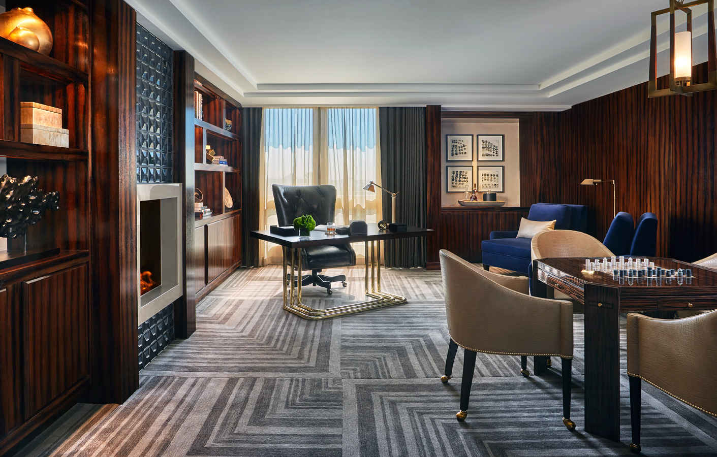
That mix included a strong, geometric gesture that is repeated, subtly, from the lobby to the patterns flanking the tufted headboard in the presidential suite, which boasts its own media room with luxurious, chocolate-brown velvet chaises. Even the most modest rooms were reconfigured—beds reoriented, dressing area expanded—to maximize glamour. For what Smith calls the “ultimate dressing space,” a three-way mirror with lighting that adjusts from outdoor to daylight to evening is close to the reimagined closets, which account for every last detail, even specially designed space for heel heights reaching Louboutin proportions. Space is still maximized, with extra storage for everything from blankets to travel suitcases, and a tea-height table and bench seating for en suite dining. Materials are luxurious yet hardy: Ultraseude, lacquer, parchment, velvet and leather. “There’s a rich feel, with nods to vintage,” Smith notes. “We went glamorous, playful and fun. And the rooms get glitzier, with dripping chandeliers and bold uses of color.”
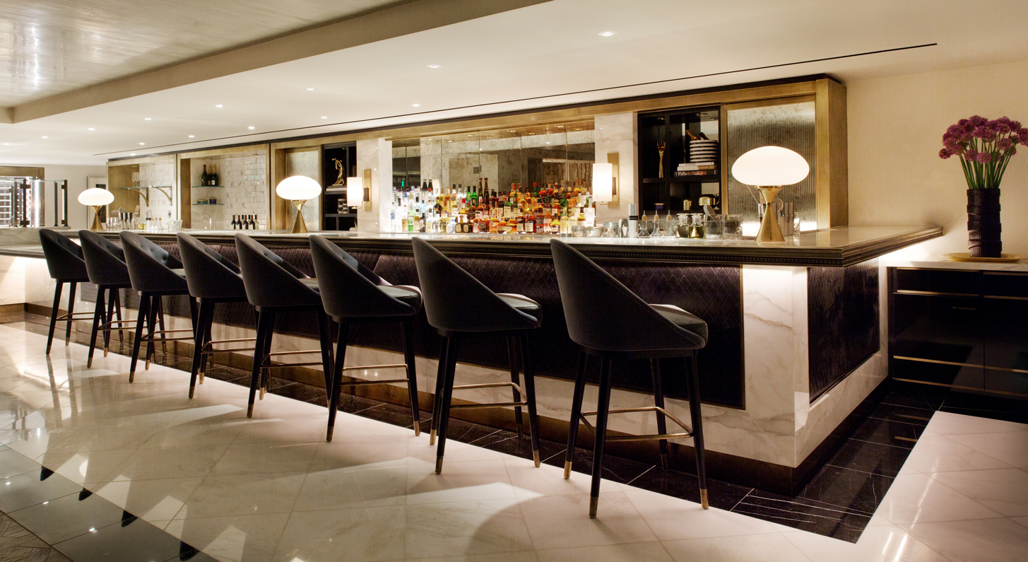
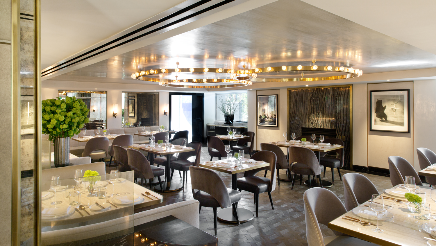
Downstairs, challenged by low ceilings—as in only 7.5 feet tall—Smith’s plan was “to make everything light and neutral with a lot of detail.” For the bar and lounges, Smith conjured a French bistro, with nods to fashion, from bouclés to the Chanel stitching edging the bar, which also fuses vintage pewter, stone, leather, brass and antique mirror. A secret wine room nearby also hosts dinner service. Throughout, Smith introduced artwork ranging from 1980s Lacroix to black-and-white photographs of bears and ballerinas. “They wanted some eclectic art,” Smith says. “It was important to let art be the focus, which is the way design is headed these days.” There are giclée prints by Adam Santelli and Jody Morlock, and Eric Boyer’s hand-sculpted wire mesh forms. And after a long and diplomatic negotiation with the Yves Klein Archives in Paris, the hotel was granted exclusive use of a previously unpublished blue monochrome image reproduced and hanging in the guest rooms—a feat reached only by Viceroy L’Ermitage Beverly Hills. As for the lobby? “The lobby vibe is that it isn’t a lobby,” Smith says. Indeed, it seems more like a modern residence than a hotel, which was the point of the design. Says Smith, “It feels perfect for a long stay.”
SFA, sfadesign.com; L’Ermitage, viceroyhotelsandresorts.com/en/beverlyhills
Save
Save
Save
Save


