SHINE ON
Text: Heather Corcoran
Photography: Kim Sargent
The moment Andrew Petronio saw the Hamptons home of a new client,
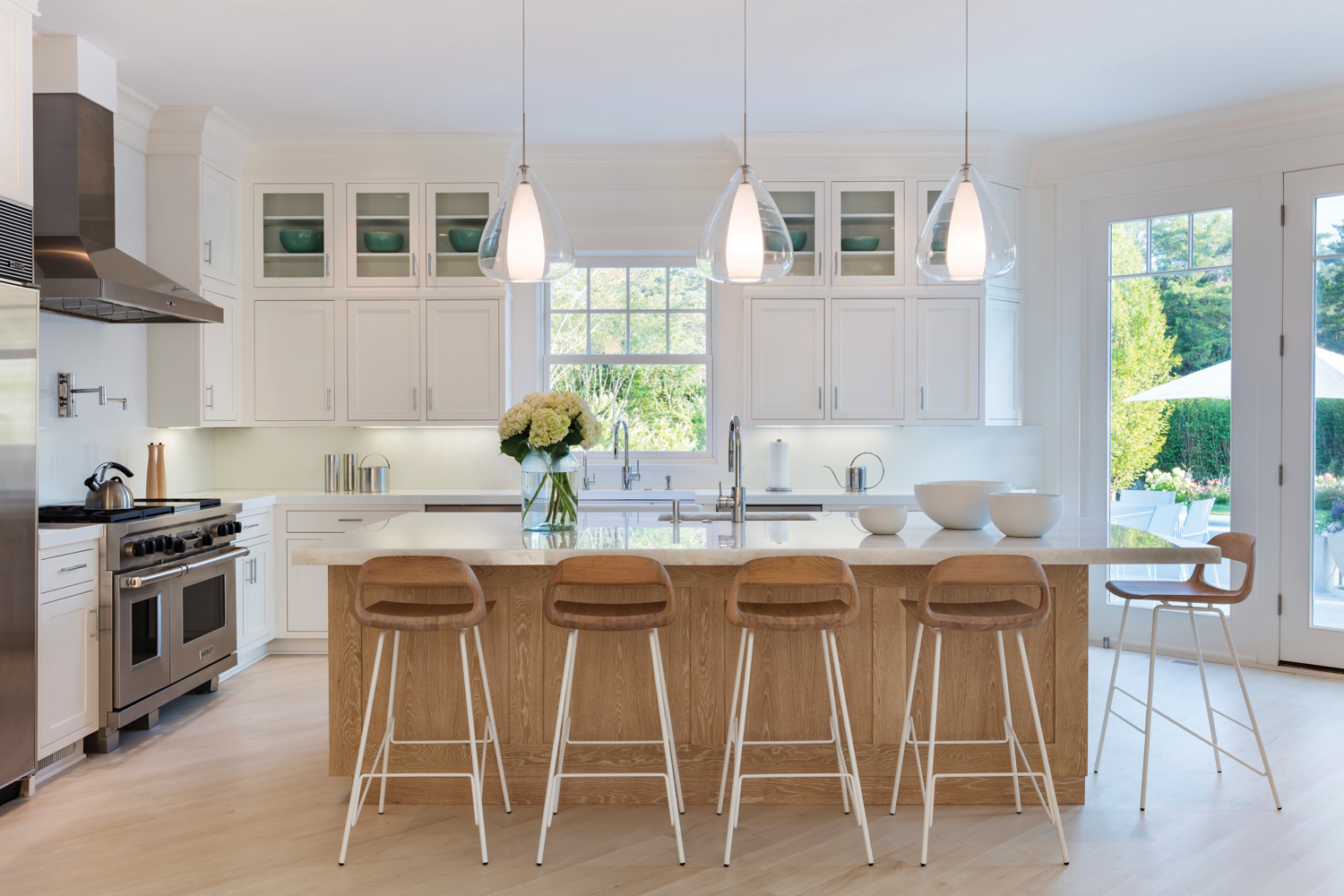
one thing was clear: It really needed to lighten up. The driveway pulled right up to a small porch, making the capacious house feel hulking. Inside, heavy mahogany banisters and fussy architectural details left the space feeling cluttered, overly formal and, frankly, “suburban,” says Petronio, a partner, with Kenneth Alpert, in the Manhattan firm KA Design Group.
At the time, the six-bedroom home was about 12 years old, but it already appeared outdated. “We always had a vision for the feel of the house,” says Petronio, who describes it as a calming, earthy escape. “It’s just that the architecture wasn’t agreeing with it.” To shape it into a serene beachside getaway for a newly married couple, each with adult children, the first step was rethinking the plan, stripping partitions between first-floor living spaces, doing away with démodé touches such as a butler’s pantry, and stripping architectural details like the pilasters and crenelated moldings that weighed down the double-height entry. “No one needs to feel like Henry VIII when they’re in the Hamptons,” Petronio jokes.
“We had to open up all the architecture and lose a whole lot of doors,” recalls Petronio, who created a wraparound porch to frame a more down-to-earth entrance. Inside the entry, new architectural paneling on two walls—“You’re not going to achieve that warmth with a wallcovering or paint,” Petronio says—frames a long work of art by Pop artist James Rosenquist, one of the gems of the residents’ combined collection of contemporary art and photography. The piece is layered in crisp, graphic colors, but the room around it is a neutral palette as soft as sticking your toes in the East End’s sugary sand.
It’s an impression that starts from the ground up, in this case with a riffed bleached (“very bleached,” Petronio emphasizes) oak floor, the color and tone of which the supplier went to great lengths to perfect. “I wanted everything to be anchored by the floor, to grow out of it,” says Petronio, nodding to the sculptural Jiun Ho table that emerges from the center of the entry, its organic bronze base topped by white marble. Nearby, an angular console, also designed by Ho, provides a geometric counterpoint.
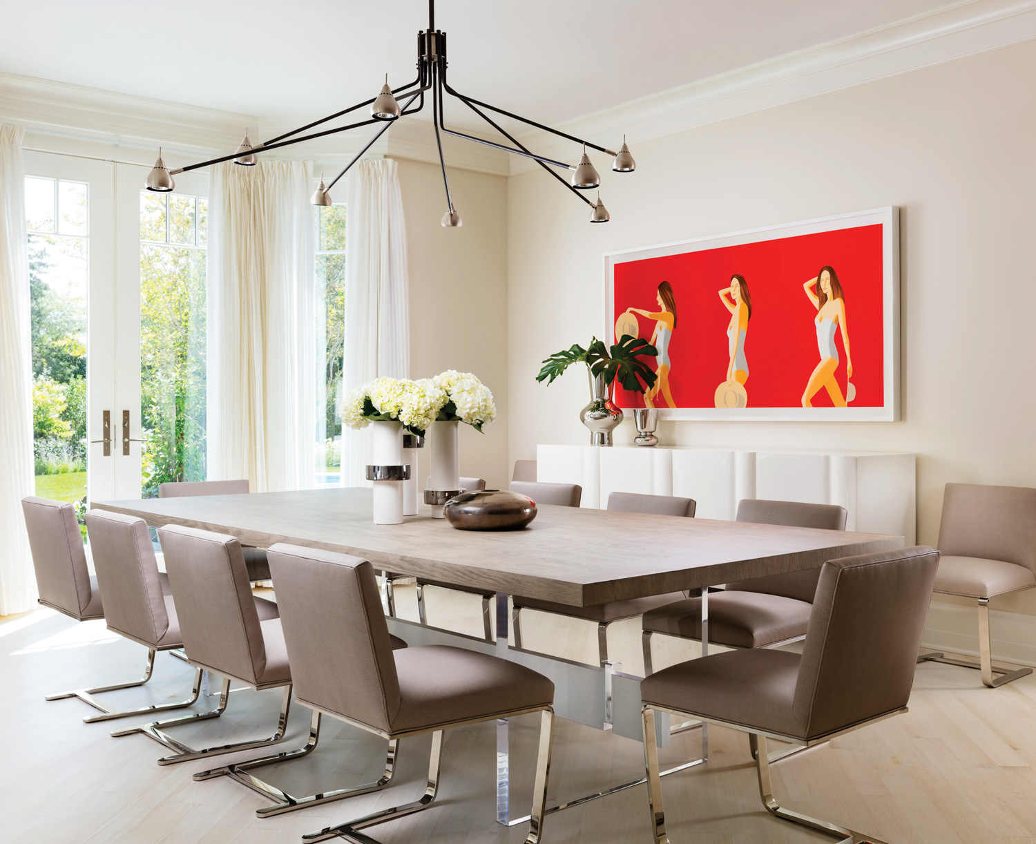
 As the pale oak floorboards lead through the house, they’re occasionally topped with cotton faisal carpets (downstairs) or wool and silk blend rugs (in the bedrooms), or set at a 45-degree angle to the room as in the updated kitchen and dining room, where they crisscross beneath a custom Artistic Frame dining table. Above, a Sofia chandelier by Fuse Lighting sourced from Dennis Miller Associates in New York hugs the ceiling—a more architectural answer to a chandelier, another of Petronio’s subtle twists toward a more contemporary style. The mixed-metal fixture, in oil rubbed bronze and satin nickel, also adds just a hint of depth to the palette—a careful ratio of light to dark, about 85 to 15, Petronio estimates, employed in each room of the house. On the wall, a work by Alex Katz with a flat background the color of a ripe tomato pops like a colorful beach umbrella on the strand. “Maybe if you saw it in the city, it would be a little overwhelming,” Petronio says of the high-contrast approach to color, “but out at the beach there’s so much light that it almost eats up the color.”
Though the home unfolds from one creamy colorscape to another, it’s anything but monotonous—Petronio says the paint schedule ran four pages of Benjamin Moore hues. “There are at least 100 shades of beige in this house,” from carpets to ceilings, teases the designer. It’s a subdued palette with a purpose: “All the furniture, the colors, the fabrics, the carpets—they sort of disappear. You just notice textures.
”That effect can be felt in the main bedroom, where a Holly Hunt bed emerges from a single wall of woven paper wallcovering from Phillip Jeffries. In the corner, Eero Saarinen’s iconic Womb chair, upholstered in pale lilac fabric, offers a welcome hint of color, and a place to read a book, atop a textured oatmeal carpet from Stark. Pillows are used to similar effect in the family room, where they provide dollops of burnt umber. In that room, a mix of wood species—a driftwood-and-resin side table and a coffee table in dark oak—dominate the material palette, while a molded plywood Eames Lounge and Ottoman are upholstered in pale leather. In one act of modern insouciance, the new mullioned windows were left intentionally undressed. When need be, built-in solar shades can be drawn. After all, aren’t landscaped views what the Hamptons are all about anyway?
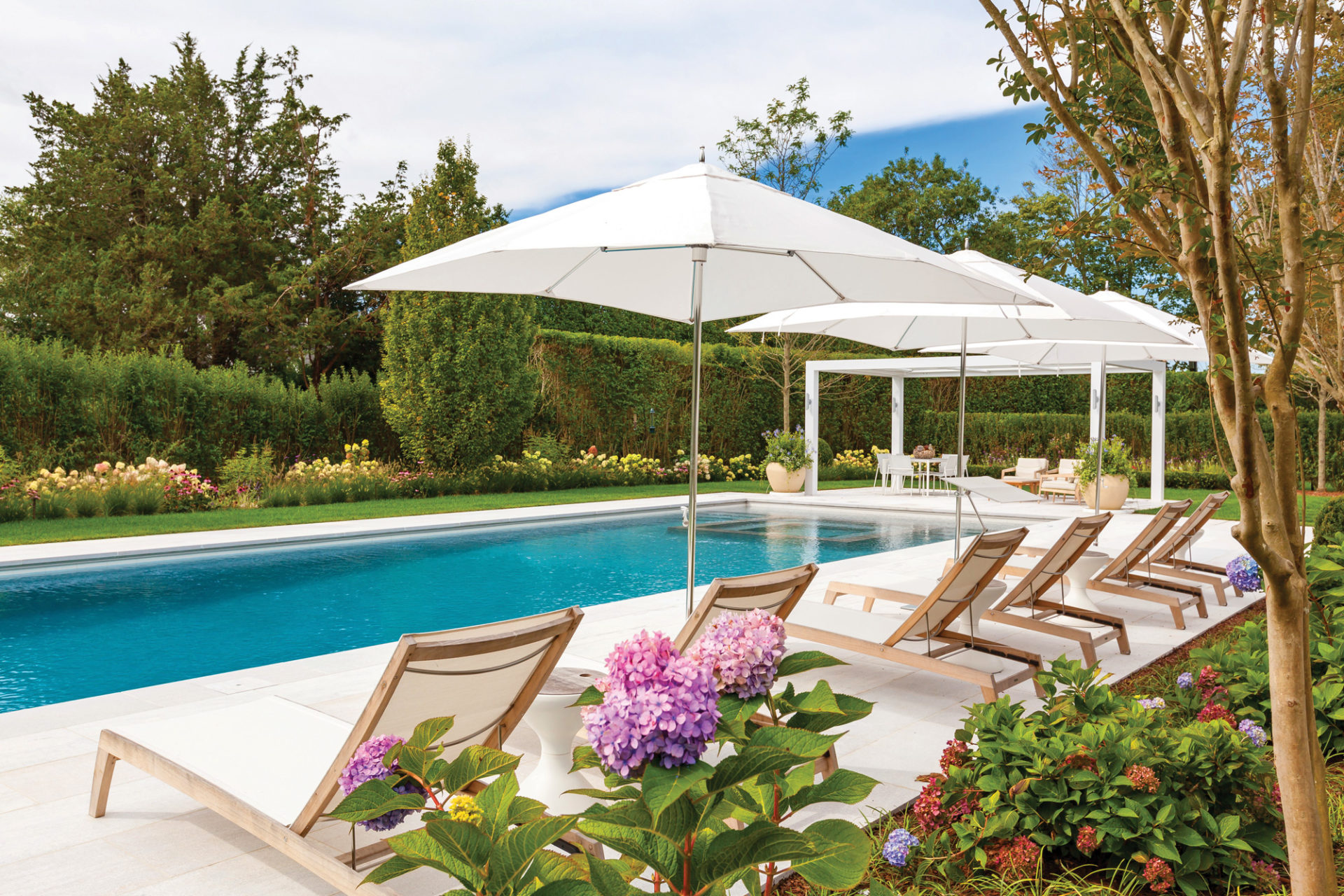
At the rear of the house, modern French doors reaching 10 feet lead to the terrace and yard. Topped with sheer white drapes made from Kravet fabric, the doors allow more of the famous Hamptons sunlight into the home than before. They also let in views that were once dominated by the pool, a feature that’s covered some seven months of the year. That’s why the team shifted the pool to a more discrete location, giving pride of place to the Bianca Mist marble patio. There, against the cool white stone, Gloster dining tables and chairs offer seating for up to 16—perfect for al fresco entertaining well into the cooler months. KA Design Group, kadesigngroup.com
Save
Save
Save


