Published As:
All Together Now
Text: Lisa Bingham Dewart
Photography: Stephen Busken
At first glance, dance and interior design might share few parallels. But there is a key similarity for Los Angeles–based Jeff Andrews, who was an in-demand dancer and choreographer before embarking on his next act as an in-demand designer with a star-studded client list. “Much like a choreographer working with dancers, the collaborative aspect of creation is the key to great results in design,” Andrews says. “For me, everything is about collaboration. Whether it’s with design clients, artisans, fabricators, or in product development, the creative process is so much more valuable and complete when the communication is open and not dictated by one person.”
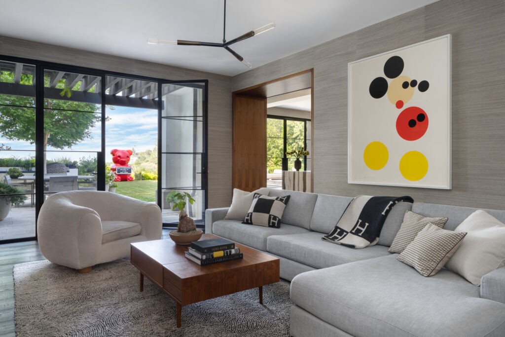
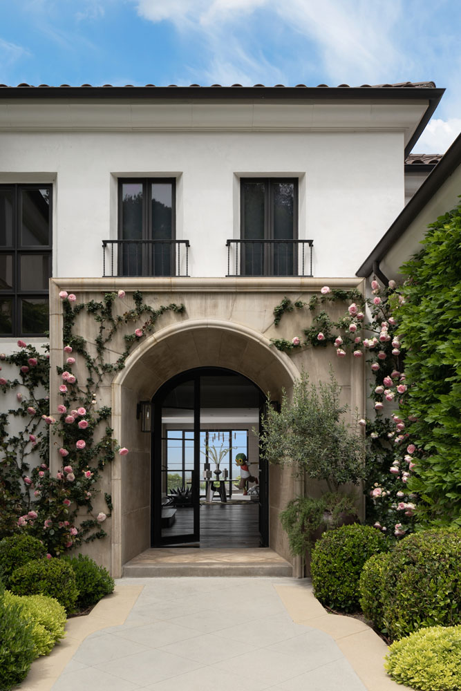
Andrews brought this collaborative approach to a hilltop remodel in Beverly Hills with a longtime client looking for a more contemporary aesthetic. “I knew enough about what he liked and didn’t like, but when you’ve worked with someone previously, and now they’re in a different life phase or have a different style, they can throw you a curveball—you have to communicate,” says the designer. The pair agreed on the shape the home would take. “Neither of us wanted a lot of frills, but did want something clean but infused with some drama,” the designer says. “I’d call it a livable, modern glamour.” Outside, that meant more glazing to maximize the views of the San Fernando Valley, and for both the new and existing windows, he chose steel frames for an updated look. (Andrews made several structural changes, such as opening the previously dark, isolated-feeling dining room onto a sitting room.)
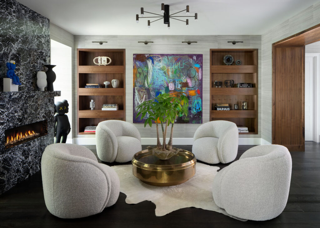
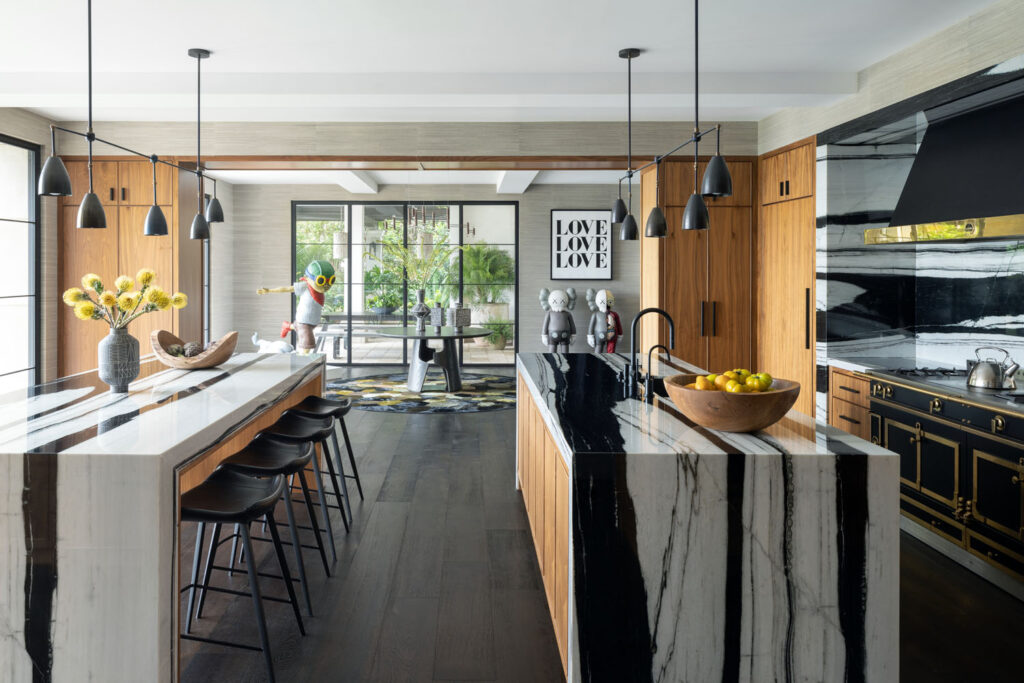
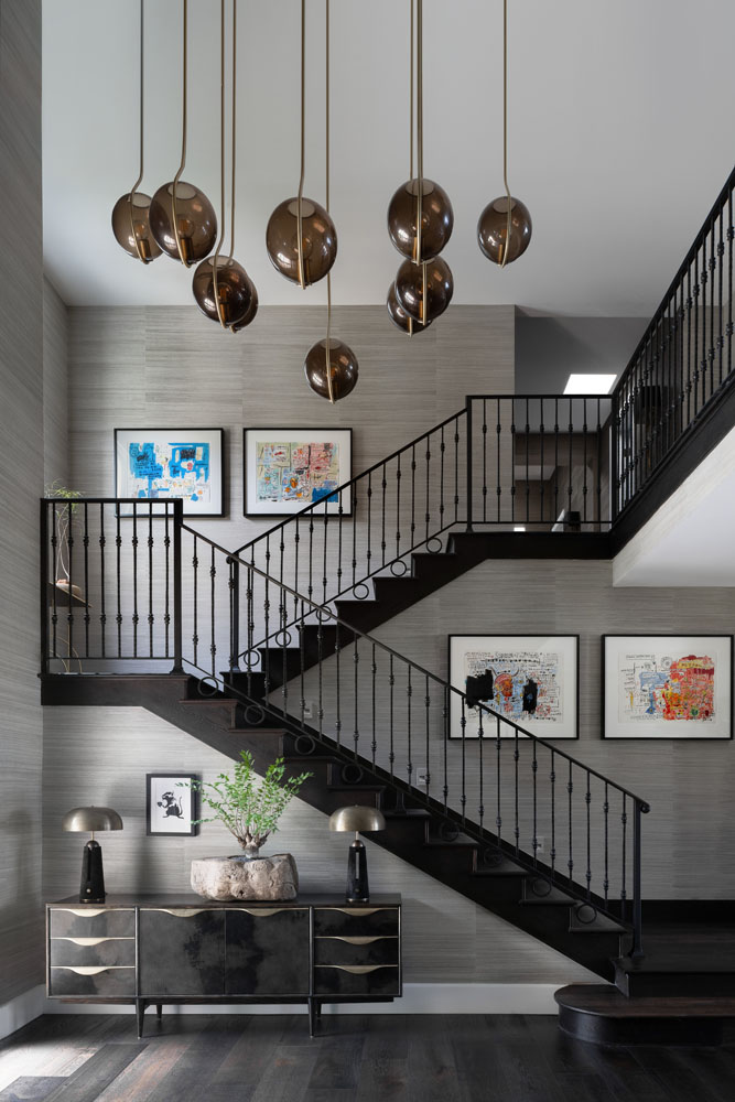
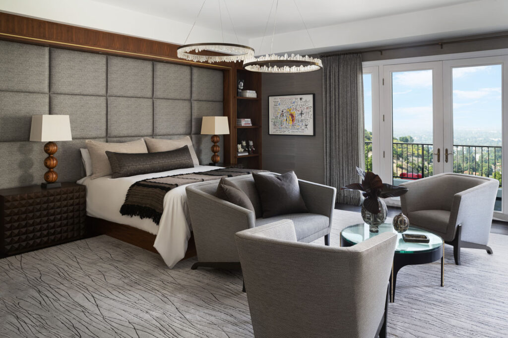
Inside, the palette is primarily black and white, with dark wood floors, copious amounts of walnut for the cabinets and built-ins, and eye-catching marbles and other stones woven throughout. The foyer establishes this rich energy. “We stripped it down to gallery-level architecture,” says Andrews, who removed the white paneling and hung a Phillip Jeffries grasscloth on the walls as a counterpoint. “We wanted texture rather than paint, and the client loves grasscloth. It has an organic vibe that warms up the modern spaces,” he says. The walnut, too, brings more of those organic moments. Andrews framed openings with the wood, such as the one between the sitting and dining rooms, used for built-ins, including the primary bedroom’s upholstered headboard and side tables and the kitchen cabinetry. There, paired with the dazzling black-and-white quartzite, the effect becomes “functional art,” Andrews says.
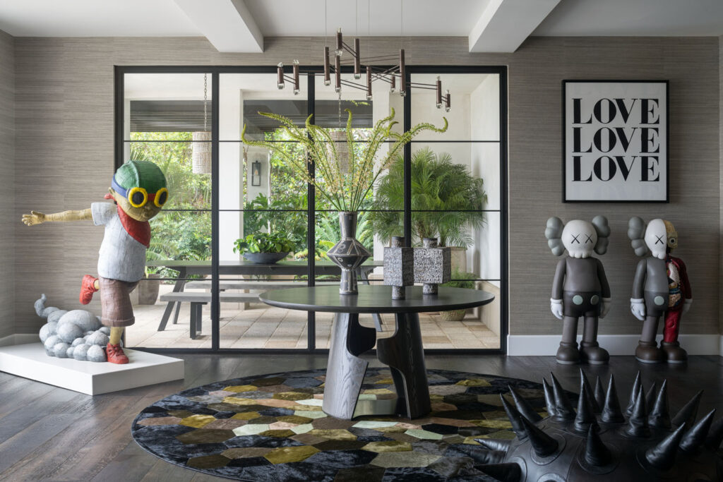
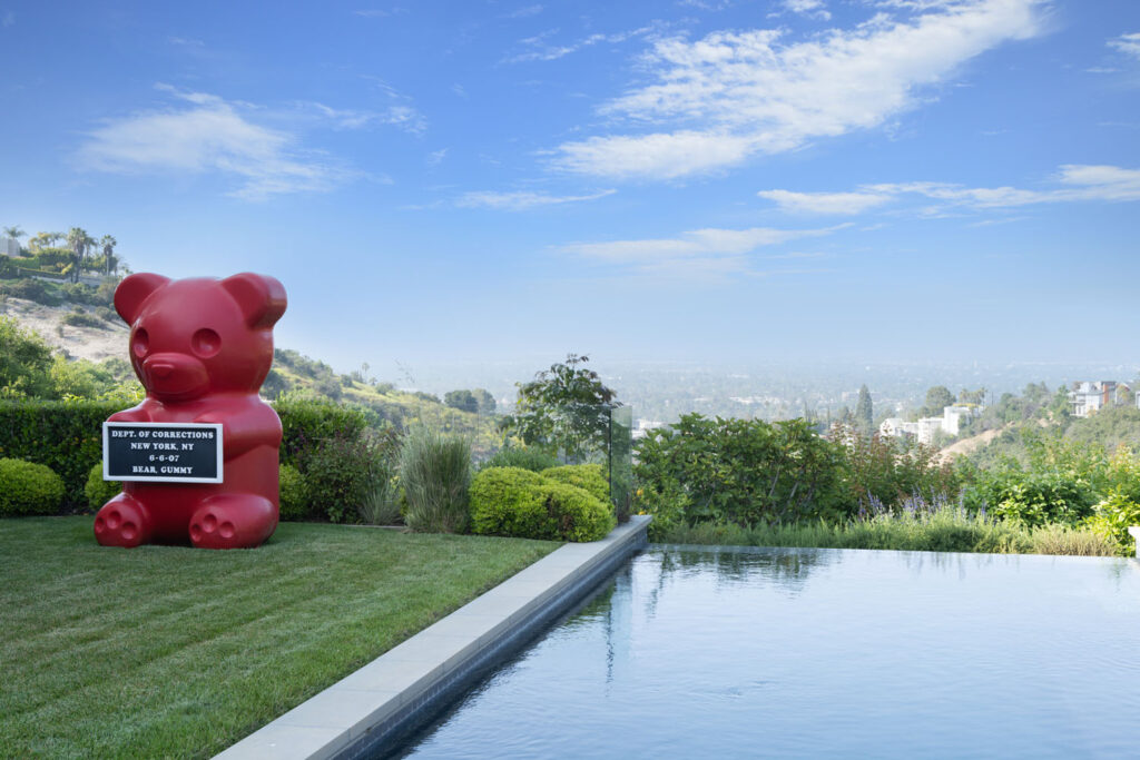
Art is everywhere in the house. “He’s specific about what he likes—Pop art and things that have a bit of humor to them,” Andrews says of his client’s preferences. “It was fun to infuse them in a modern space.” Collected both before and throughout the project, the artwork appears around the house and ranges from Basquiat prints in the foyer to a monumental WhIsBe Vandal Gummy positioned by the pool. Nowhere, though, does the collection take center stage quite like it does in a spot off the kitchen near the main entry. “We were unsure how to utilize it for a while,” says Andrews, who notes the client didn’t want to attach standard labels and functions to the rooms. Now, it serves as a gallery showcasing some of the larger pieces, among them a pair of KAWS sculptures and Flyboy by Hebru Brantley.
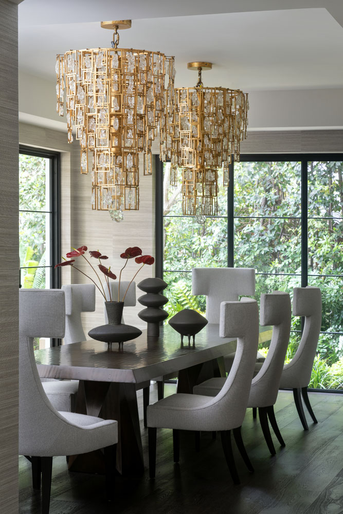
As much as the home is the product of a close collaboration between Andrews and his client, it also speaks to his connections in the design world. In many cases, he incorporated items from his collections with A. Rudin. In the primary bedroom, for example, he opted for a pair of chairs and a settee from his 2857 collection for the company. “They’re architectural and quite comfortable,” Andrews notes, and the dining room chairs are a newer introduction of his from A. Rudin. “I don’t ever want to force my own designs on clients,” he says, “but they are part of my process and come to the forefront when I’m starting rooms because they have a huge amount of meaning to me.”
Andrews also turned to the work of other industry peers. “As designers, we’re always looking for new and special things, and creating things with other artists and artisans,” he says. Working with Kyle Bunting, with whom Andrews has a collection debuting soon, he created a custom hair-on-hide rug in the gallery that rests beneath a Holly Hunt center table. (“I love to work with people to create or customize pieces so that you’re putting your signature on them,” he says.) In the same space is a chandelier by Bec Brittain, another beloved source. He incorporated pieces from other favorite makers elsewhere—the sitting room chairs are by Evan Spencer, the rustic-meets-modern dining room table is by Woodland Furniture, and Heather Rosenman ceramics are placed throughout. As much collaboration is essential to the success of each of Andrews’ projects, it’s also the secret sauce that keeps him engaged. “People ask me if I have a signature style, and I have prided myself on not having one. Each client is different and has different wants and needs, and they open up different doors,” he muses. “It still feels new to me,” he says, “because it boils down to who you’re working with.” Jeff Andrews Design, jeffandrewsdesign.com
