ARTFUL
LIVING
Interior Design: Jiun Ho
Text: Lydia Lee
Photography: Matthew Millman
The first thing you notice after walking through the front door of this San Francisco residence is the guardian of the house—an almost seven-foot-tall figure of a fearsome Bamileke king from Cameroon. Once past him, you are in a heightened world where nearly every wall is populated with modern art and nearly every room is graced with antique furniture. The clients who curated this heady, diverse mix chose San Francisco–based designer Jiun Ho to design their home. Eschewing the obvious approach of an all-white gallery, Ho strategically used color and complementary furnishings to create a vibrant environment that supports the clients’ beloved collection.
“The clients have a very eclectic aesthetic that is also classic and timeless,” says Ho, who has a showroom and studio in San Francisco. “I wanted the space to tell a story about who they are and reflect their interesting backgrounds and personalities.”
The clients are scientists in the biotech industry and have wide-ranging interests in art and music. The gentleman who focuses on African art is African-American; his husband, who collects post-WWII and contemporary works by European and American artists, is originally from Germany and a classically trained pianist. Over the years, they’ve acquired more than 300 pieces, including those by German painter Anselm Kiefer, British artists Gilbert & George and French minimalist Yves Klein, along with those by more obscure talents, such as Greek-Austrian sculptor Joannis Avramidis and German artist Herbert Zangs. But they also appreciate ornate 18th-century French furniture and unique design objects like Ingo Maurer’s limited-edition Flatterby lamp.
Ho, a friend of the couple’s, was charged with a complete renovation of their new house. They had previously lived in a co-op apartment in Nob Hill, but decided to move in favor of more space—and an opportunity to enjoy more of their art collection. They found a 1920s Spanish Revival home just below the crest of Pacific Heights with a sweeping panorama of the Bay. Facing north, the three-story home was also good for displaying art, since it received bright but not glaring light. However, it had spatial irregularities such as an interior courtyard that took up a fair amount of space, and one had to climb the courtyard’s exterior staircase in order to enter the house. Ho, who studied interior architecture, reclaimed the courtyard as interior space and reorganized the home around a new grand staircase, now lined with works by Alfred Jensen, David Ortins and Anselm Kiefer.
The home’s expanded interiors—3,300 square feet over three levels—showcase a sizeable part of the collection, which continues to evolve. “Every time I visit, there’s something new,” says Ho. The living room, dining room and kitchen occupy the top level, which has grand views of Alcatraz and the Golden Gate Bridge; the second level holds the master suite and guest suite/media room. On the first level, near the front door, a second guest bedroom doubles as a gallery where the clients display works by emerging and experimental artists.
As in a good museum exhibit, the various elements in the rooms—art, furnishings, architecture—engage in a fascinating conversation about the obsessions of different generations of creative minds. The living room is an excellent example. Here, Ho placed a pair of Louis XVI corner benches on either side of the Steinway piano, where they reinforce a sense of symmetry and decorum. On the wall is an Aaron Young work that was created by driving a motorcycle over metal panels. Ho paired Louis XV chairs and a minimalist bronze coffee table designed by the owners and fabricated by Henry DeFauw, bridging them with his Chambord sofa. He also removed the fireplace’s carved stone surround, replacing it with a minimalist frame in white marble. “The subtle modern details are a nice contrast,” Ho says.
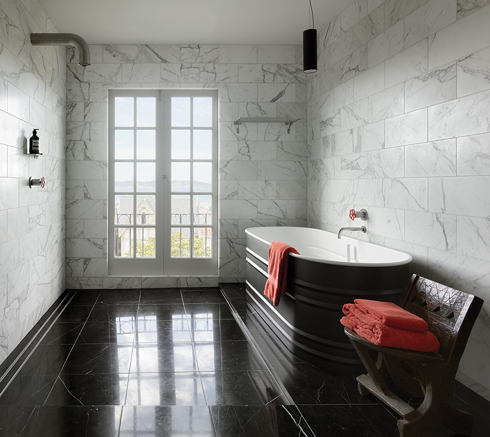
Ho created a completely new kitchen that feels like its own work of postmodern art, beneath a vaulted ceiling that echoes the home’s traditional archways. He met the client’s request for a German kitchen by installing Bulthaup cabinetry and Gaggenau appliances. The cabinet fronts are walnut and aluminum, paired with a sleek backsplash of white marble. Dominating the kitchen is Robert Mapplethorpe’s 1987 Hyacinth, acquired by the couple at auction. The master bath makes another strong graphic statement in black and white marble with striking Boffi Pipe fixtures and a Vieques bathtub by Patricia Urquiola for Agape.
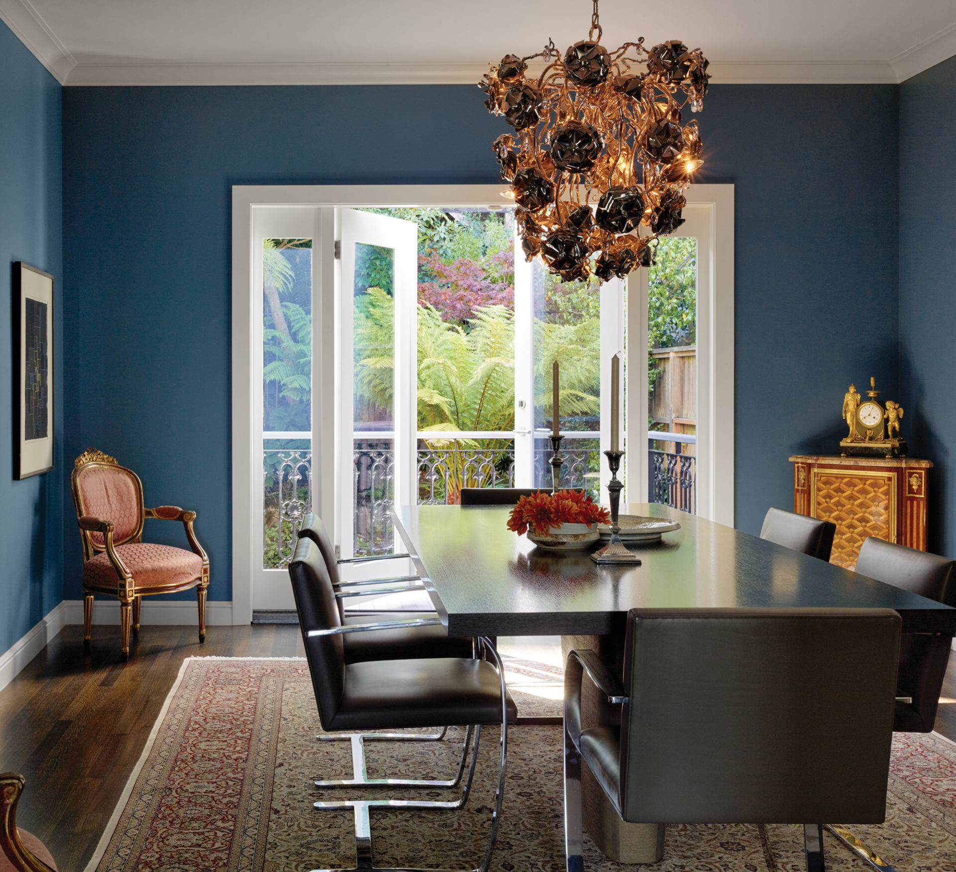
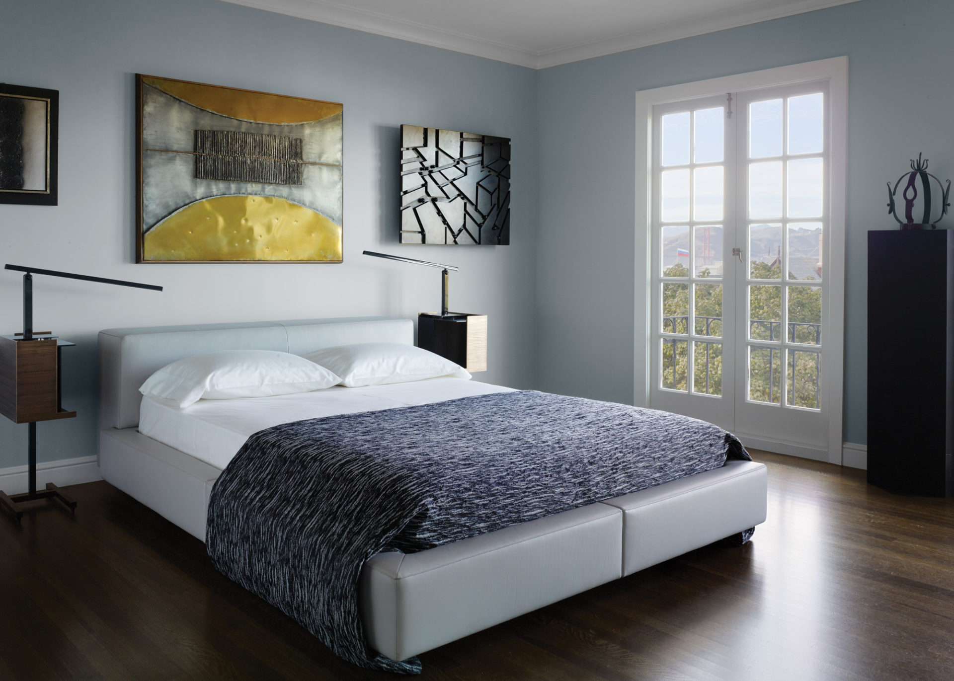
To bring the exceptional views inside, Ho chose to paint the walls primarily in a range of blues and grays. “You see the beautiful bay and how the water changes colors depending on the time of year and the weather,” he says. Looking from the living room toward the dining room, you see that gradation in color from white to gray-blue. The shift also underscores a change in ambiance—from the more public side of the house to the more intimate dining room in back. It’s a subtle effect, but one that fits well into the clients’ philosophy of collecting. Says the German client: “We look for something with more than just a linear reading.” Jiun Ho, jiunho.com
Save


