Artful
Glamour
TEXT: CAROLYN HORWITZ
PHOTOGRAPHY: GREY CRAWFORD
For all its sophistication, there’s a gentle subtlety to the work of Jeff Andrews. “I don’t like anything to pull too much of a focus,” the Los Angeles–based designer says of his strategy for interiors. “They feel beautiful, but there’s nothing really shocking. It’s more about how you use the room, and when you’re in the room for more than a few minutes and you look around, things kind of present themselves to you bit by bit, and then it all makes sense.”
It’s an approach that’s surprisingly understated for a designer whose client list features some high-profile names, such as Kris Jenner and daughter Kourtney Kardashian, and who is releasing his first book from Rizzoli, The New Glamour: Interiors with Star Quality. But applied to a recent project—a home for a low-key family with three children—it’s a perfect match.
Andrews was essentially given free rein in renovating the contemporary Mediterranean-style house in Beverly Hills. He took it down to the studs and reimagined the flow of the first floor to meet his clients’ needs, eliminating, for example, an unwanted formal living room and carving out a dining room that can accommodate large family meals. For the décor, he developed a palette of neutrals enlivened with metallic-derived tones of bronze, brass and pewter, complemented by a steady rhythm of art.
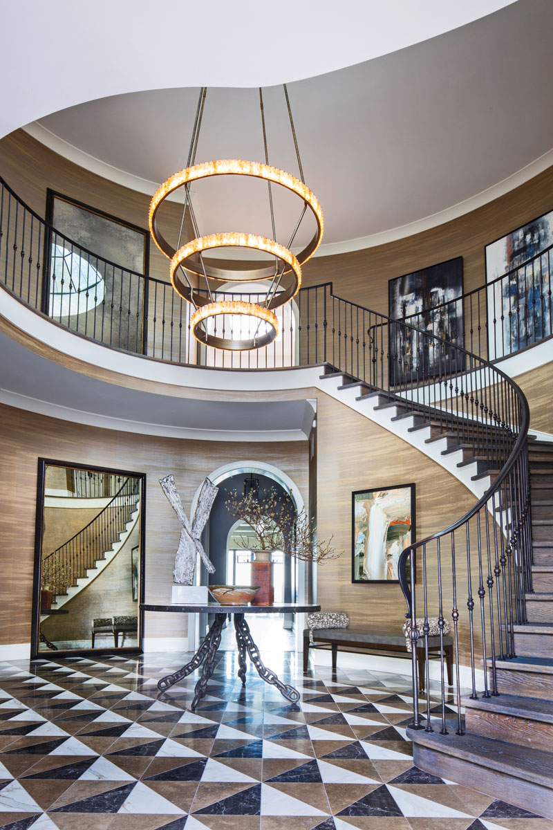
There’s an urbane livability to the house, which displays a mix of styles and periods that defies trends or labels. The clients, he notes, are not ostentatious and “more on the traditional side as far as their taste in interiors. But I kneaded the whole process a little bit and talked them into a more contemporary interior that was transitional and had elements of what they were drawn to, but also was elevated in a way that made sense to me for their age and their lifestyle.” As part of this he injected a quiet theatricality that’s especially evident in the entry, which resonates not from excessive ornamentation but from a sense of movement. Relocating the staircase from its original position in the center of the space (where it was “all wrong,” he says) to one side resulted in a sinuous configuration, a swirling effect that’s enhanced by the horizontal linearity of hand-painted wallpaper by Maya Romanoff and the concentric circles of Petra Powell’s smoked-quartz chandelier for Wired.
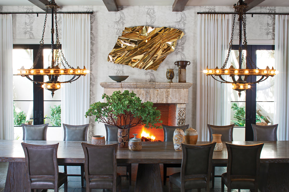
Andrews customized the entry’s geometric floor pattern with marble, granite and limestone tiles of his design from Ann Sacks, activating the space. At the center, a chain-legged Atlantis table by Jerry Pair for Formations lends an Old Europe feel that’s echoed by the Spanish-style stair rail. Just off the entry, there’s a step down into the dining room, which can easily seat 18 at a monolithic Hobart table from Woodland Furniture. Two weighty chandeliers that originated from a 1910 bank building are hung low for a dramatic effect and are juxtaposed with a crumpled gold metal sculpture by Peruvian artist Aldo Chaparro, mounted above an antique limestone fireplace mantel.
The family spends most of its time in the adjacent den, which is anchored by two custom L-shaped sofas from A. Rudin (with whom Andrews collaborates on a furniture collection) that face each other to form a nook. In the main hall just outside, an Invisible Man wire sculpture from Phillips Collection joins a piece by Sheila White and leads to the den’s art corner, with Howard Hodgkin prints, recessed shelves lined with Andrews’ Jamie Beckwith Collection tiles, and The Keeper, an abstract ceramic sculpture by Cybele Rowe. It’s a generous room—there’s a wet bar on one end, and a smaller seating area with Andrews’ tall and enveloping chairs designed for A. Rudin flanking a sculptural bronze game table by Paul Marra at the other—so Andrews employed a rich oak ceiling treatment to impart coziness.
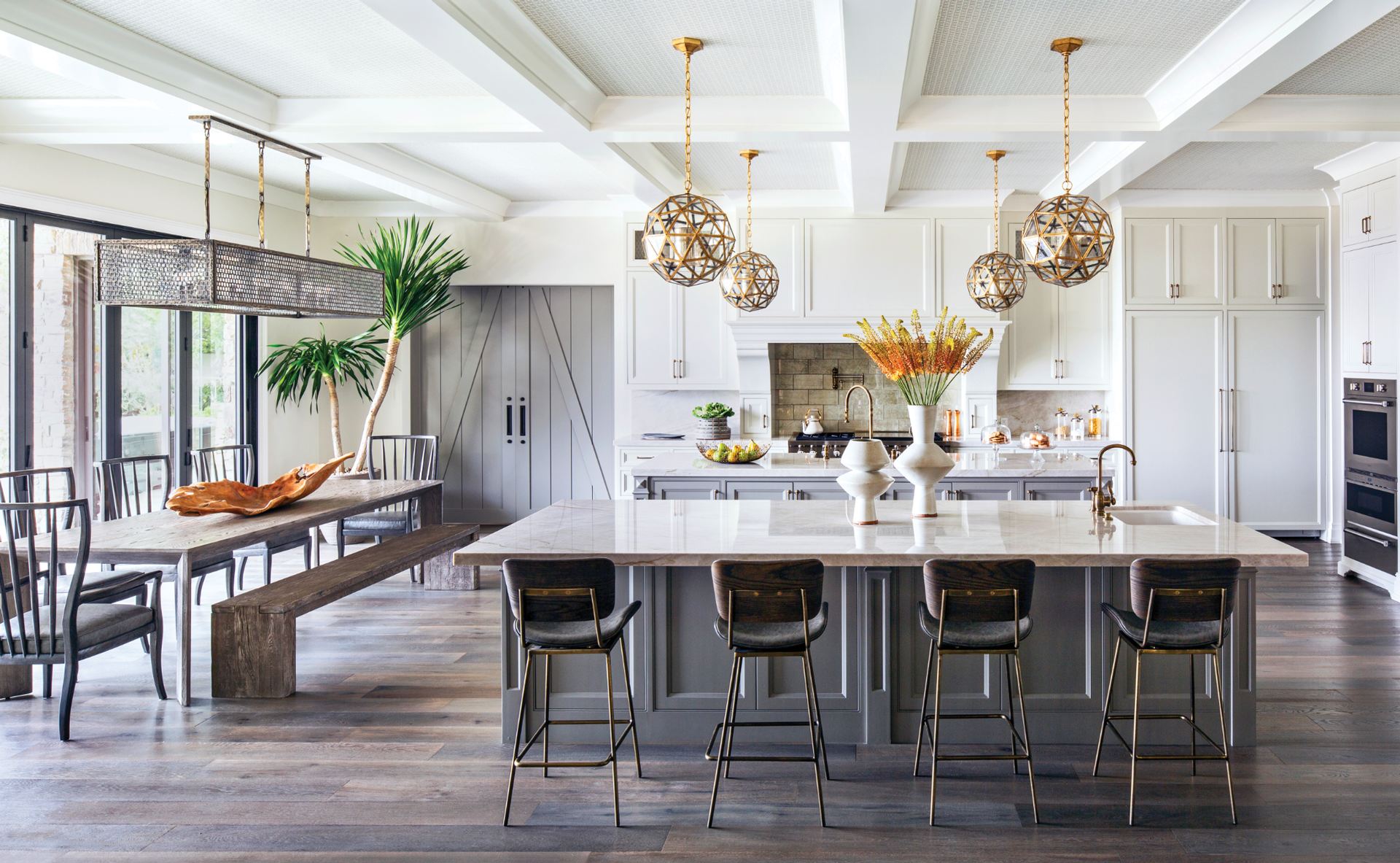
The kitchen, too, is oversize; Andrews gained square footage by moving it from one end of the house to a central location. “It’s interesting when you’re working with a really large kitchen, because the whole ‘kitchen triangle’ thing still rings true,” he notes. While keeping that in consideration, he also had to contend with the fact that the kitchen opens to other rooms on all four sides, which made it “a challenge to conceal everything you need to conceal and make it functional and beautiful and the heart of the home.” He resolved this by creating two islands, which elegantly add storage space. He added visual interest to the ceiling by installing coffering with subtle gray Volpi wallpaper from Quadrille.
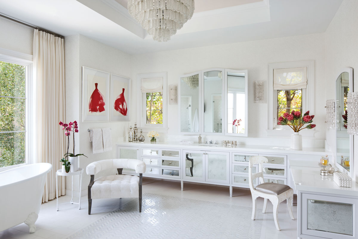
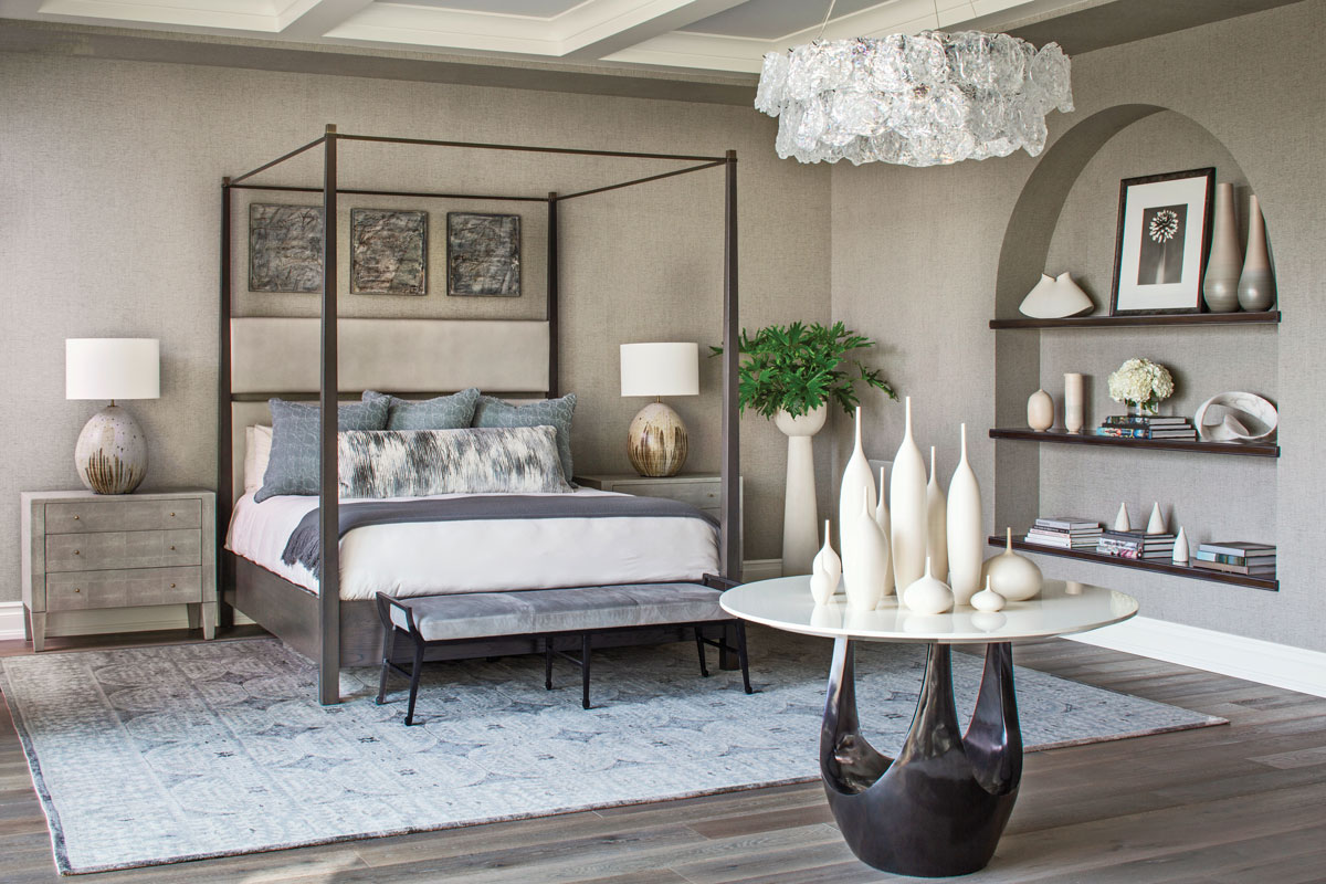
Upstairs, the master suite has two dramatically different bathrooms: his, rich and dark, with large slabs of Café Argento marble from Walker Zanger; hers, airy and light, with a floor inlay of marble and mother-of-pearl mosaic tiles from Ann Sacks. In the bedroom, coffered ceilings add intimacy to the large space, while the muted color palette, softly textured wallpaper, and Rock Edge crystal chandelier by John Pomp create a dreamy vibe. A focal point is a collection of vases by Sara Paloma, displayed on Jiun Ho’s sculptural Ulu table from Thomas Lavin. “I’m obsessed with ceramics—the shape and the texture and the handmade quality,” Andrews says. The organic simplicity of the matte white vessels is the perfect embodiment of his philosophy of restraint. With a relaxed attitude toward design, he says, “I don’t think you can go wrong.” Jeff Andrews Design, jeffandrewsdesign.com
Save
Save
Save

