MILE HIGH
STYLE
Interior Design: Arianna Noppenberger
Text: Erika Heet
Photography: David Lauer
For designer Arianna Noppenberger, the opportunity to rework a residence at the Four Seasons in Denver
was a welcome change from her usual beachfront milieu, but with the comfort and familiarity longtime clients provide. Having designed several residences for the clients, a couple with grown children, Noppenberger is now designing for the next generation, with commissions for the clients’ son and daughter and their families. As empty nesters, the couple sought “a house in downtown Denver where they could have an easy lifestyle—a place that would allow them to travel more, to be able to just lock the house and have nothing to worry about,” Noppenberger says.
Working within the strict parameters created by a residence dozens of floors above the city, the designer took down walls in the original four-bedroom, four-bathroom unit, envisioning a more open space from which to take in the sweeping views of the city and Rocky Mountains beyond. As in her beach houses, Noppenberger borrowed from nature for the interiors. “I drew from the presence of the beautiful mountains and took the palette from outside,” she says. “You see whites from the snow on the mountains, the grays of the city—and lots of wood.” She skillfully integrated these influences while navigating around other restrictions, including structural steel and concrete columns, weight and size limits, and freight elevator restraints. Her solutions were ingenious: instead of marble, she used Maxfine, a lightweight porcelain veneer, a dead ringer for the stone but at a fraction of the heft. Where low ceilings felt oppressive, Noppenberger carved out valuable inches above in the form of large recesses, dressing those with dropped geometric panels that add visual interest and hide inner workings, such as the subtle lights emanating from within. “This way, we were able to get volume and movement in the ceiling,” Noppenberger says.
Noppenberger kept a similar approach at the floor level, where throughout, she “floated” elements in every room. The main living area’s hearth rises several inches off the floor, and glows from below like the ceilings thanks to hidden lights. The glass Gallotti&Radice dining table almost disappears, save for its Y-shaped steel structure that gives it a sculptural appearance. The office is reached via a small underlit step up, while both the master and guest beds, custom designed by Noppenberger, hover above the floor slightly for a sense of lightness. Her trio of custom smoky glass wine towers, which enjoy a prominent place near the entrance, are lit from the top and the bottom through acrylic panels that act as diffusers, with light just grazing the bottles. “The wine towers are like a procession to the living area; they are in visual contact with the dining room and act as a partition to the private areas of the house,” Noppenberger says. Even the base of the kitchen island, which is topped with a slender white layer from Caesarstone, is recessed, keeping it from feeling too heavy.
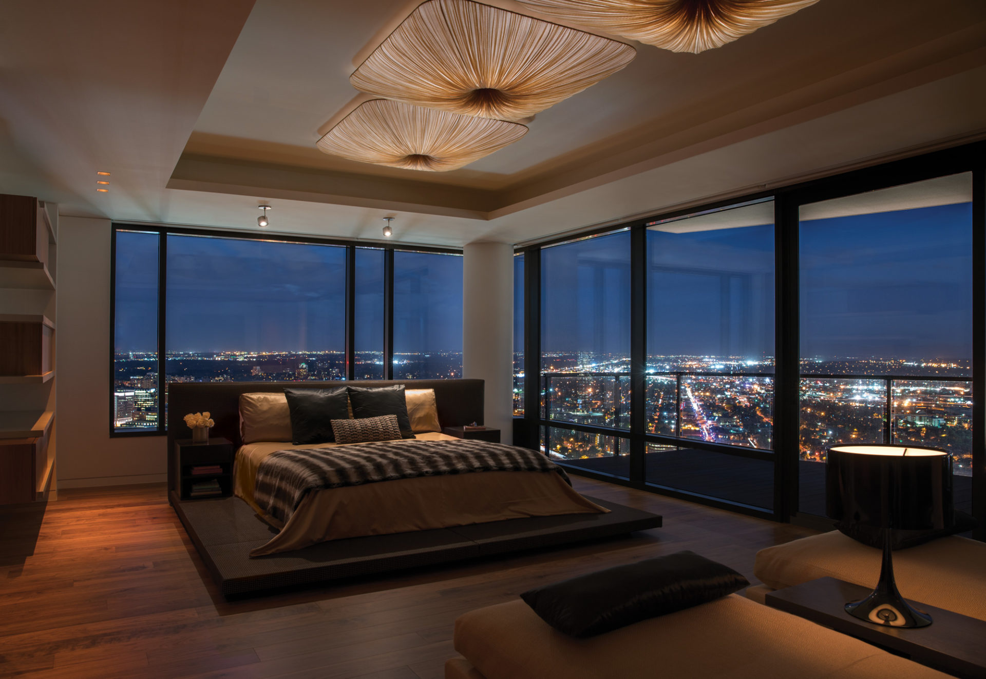
With the envelope set, Noppenberger softened the hard edges and expanses of glass with simple, elegant furnishings and dramatic lighting. For the open living room, she blended a sofa, coffee table and chairs from Minotti, which hit just below the view line. This provides an intimate enclave for the residents, who use the fireplace year-round, during winter blizzards and cool summer evenings. The room’s single light fixture is an oversize High Noon lamp, designed by EL Schmid for Zeitraum. In the nearby dining area, the understated weave of the Matteograssi dining chairs allow breathing room for the Lolli e Memmoli Bohemian crystal chandelier overhead. Just beyond the Élitis leather–clad door to the office, a sofa by Piero Lissoni for Living Divani stands on skinny legs of tubular steel. Noppenberger searched but could not find the right accent lights for the room, so she designed her own. “They were an experiment, and I think they came out pretty good,” she says. In the master bedroom, which has a long, vertical footprint and an extraordinary corner view, Noppenberger set lights from Aqua Creations into the ceiling recess above the bed. Evoking sea life and used in many of Noppenberger’s oceanside projects, the silk fixtures have a new sense of place above the clouds.
When the residents need to turn away from their surroundings, even momentarily, they utilize Noppenberger’s privacy solutions: sound-dampening materials embedded into most rooms and elegant blinds and draperies for the windows. But for the most part, the views that inspired so much of the design remain part of it. For a space that Noppenberger once described as feeling “sandwiched between floors,” it has been transformed into one that dares upstage its location, from which “on sunny days, with clear skies, you see forever.” Arianna Noppenberger, Aria Design, ariades.com
Save
Save


