ROLLING IN THE
DEEP
Text: Arianne Nardo
Photography: Jessica Glynn
I’ve never been that guy who struggles with designing a personal residence,” says Marc Thee, alluding to the aesthetic inertia that occasionally comes with the territory. This project was different. “It was about an overall journey of me processing what made me tick personally, from the inside.” Thee, the co-founder and design principal of Florida’s award-winning firm Marc-Michaels Interior Design, had experienced an unexpected personal setback before embarking on the project. It was the kind of disorienting change that Adele finds the right notes for. Driving through Orlando one morning, he saw the property—a 1960s ranch dwelling with good bones, plenty of outdoor space and a few questionable additions. He had toured the home a year earlier but had always been happy to make Miami Beach his main address. This time he was drawn to it, and instinctively called his realtor while the house was still in the rearview.
Within 24 hours Thee was the owner of a new residence in Orlando, a city where he never intended to own, about to reimagine a home that felt more like an introspective freefall rather than a well-calibrated makeover. And one with no precedent for a designer who has 35-year career creating high-end interiors. “I was going to follow my inner voice and it might not be what Marc-Michaels is known to deliver,” he says. “I was given the incredible opportunity do this by myself with no other influences.”
Architecturally, the project wouldn’t be a smooth 10-month process. “It ended up taking double that because as we dived in, every structural element crumbled,” to say nothing of the glacial permitting process. In addition to removing walls and reconfiguring rooms, all the plumbing and windows needed to be replaced, and a four-foot dome (a curious feature in anyone’s living room) had to be eliminated. But deconstruction is an incubator for new ideas, and Thee didn’t waver.
He made an early promise to himself: The heaviness of the past would be given no agency in the new space. Any object or furnishing that carried a sense of obligation or a sentimental burden would not come in. “It was about what could be learned by surrounding myself with things that uplifted me,” Thee says. At the time, Marc-Michaels was developing a special collection for Kyle Bunting, the industry’s favorite arbiter of hide and leather rugs. “Because I was in the process of working through a challenge, it all came out in this collection, which represents different phases of loss and ends in triumph,” he says.
Shatter, the first pattern in the series, is a tactile, artistic manifestation of that first shock to the system with its irregular pieces and scattered uncertainties. Thee placed the rug in the living room, a rule-defying space where he removed the walls and had a platform constructed, which not only gives the sense that it’s floating but extends a natural offer to join in. “It’s a quiet call to step up and be included in what might be my most intimate circle of friends,” Thee says of the raised concept. The fireplace and Mongolian sheepskin cushion atop the custom walnut bench impart warmth, while the rug transcends its decorative responsibilities. “The pattern is about finding beauty in what’s less than perfect, and those lessons that are found as you’re working through something difficult that leave you empowered and stronger,” he says.
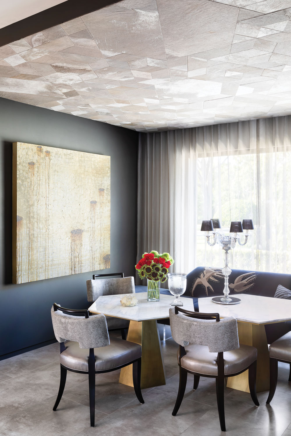
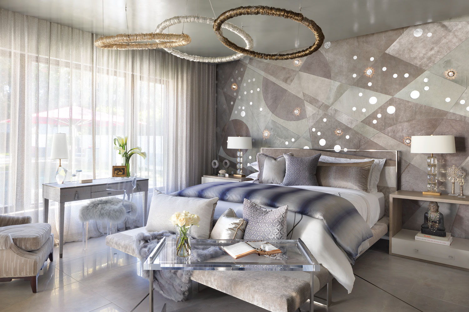
In the master bedroom, he installed Rise, the last, evolved phase presented as a sweeping, luminous celestial feature wall enhanced by custom pendants from Diospri Lighting. By placing the work on the wall, the designer asserted that the collaboration with Kyle Bunting was more than biographical, it was an exploration of verticality. Mixing iridescent leathers, shagreen and intricate patterns that would be too delicate for the rough-and-tumble existence of a rug, the series is an open-ended invite for designers to play with original, new applications. To illustrate the point, Thee treated the dining room ceiling with Shatter.
Verticality was also a repeating architectural theme. “I call it structural therapy,” says the designer. “I wanted to feel safety, security and this subliminal sense of structure and power.” Woven mesh detailing and the confident custom Neff cabinetry translated that strong, industrial attitude. The designer favors the fluidity of an open kitchen/dining experience, so the island was conceived as a chef’s table where guests could hang out or slide into the banquette. “I like a good bar, but I don’t like the real estate it takes sometimes,” Thee says. He devised a clever stainless steel rolling unit that suits cocktail hour or a lavish Thanksgiving dinner, adapting to what the occasion requires.
Many interior designers regard their homes as visual laboratories—places to experiment with palettes and concepts with abandon. Thee was focused on infusing a deeper meaning and creating emotional resonance with his gestures rather than orchestrating looks. Taken alone, the two intersecting black metal beams look cool in the entry, but they also denote the haphazard, unpredictable nature of life, says Thee. The lines were drawn randomly, and their existence seems to posit a deeper question: How will you navigate change? As he transformed the foyer, creating an expanse of glass and light and surrounding it with teak, its meaning surfaced. “I wanted it to feel like a portal,” he says of the home’s threshold. “I purposely tried to do something singularly simple and plain to kind of create that moment of pause,” a place where the smartphone is put away and the experience becomes its own passage away from distraction and toward vitality (chaperoned by an endlessly charming beloved Balinese fish sculpture).
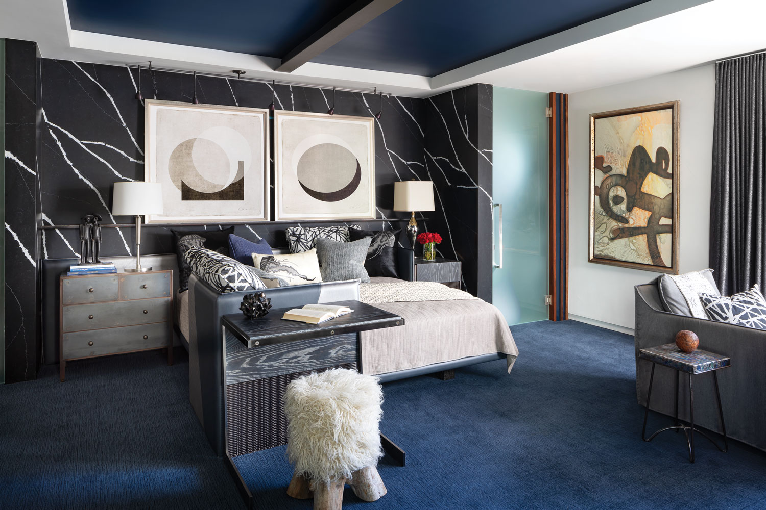
Not every space plumbs such humanistic depths. The bathrooms feel like well-dressed siblings to any luxury hotel, as do the chic outdoor spaces. A spunky “VIP lounge” with a steam room and adjacent dressing room is meant for easy lounging post sun-worship with hardworking fabrics that can handle a wet bathing suit, while a wall of Cosentino’s Silestone Marquina Suede adds requisite drama. Thee selected a jellyfish motif for the bathroom’s shower wall, a waterproof panel by Alex Turco that becomes more than a striking graphic: “Jellyfish can survive in the most turbulent waters because they float during rough seas,” he says. “So, it’s a reminder to take a deep breath and you’ll be fine.” Marc Thee, Marc-Michaels Interior Design marc-michaels.com
Save
Save
Save


