The Spirit of Kentucky
Text: Carolyn Horwitz
Photography: Julie Soefer
Lucinda Loya wasn’t planning a rigorous, high-end design when she purchased a home in Louisville, Kentucky. The Houston–based decorator—who had grown up nearby, over the state line in small-town Indiana—envisioned only an easy, relaxed getaway for her family, for use on holidays and annual pilgrimages to the Kentucky Derby. One key purchase changed all that, leading Loya on a decorating journey that saw her transform the 1875 Italianate-style mansion, purchased in a state of disrepair, into a mélange of styles, colors and eras that somehow coalesce into cohesion. Walk from one exuberant room to the next, and transitions that at first glance seem non sequiturs begin to take on logic.
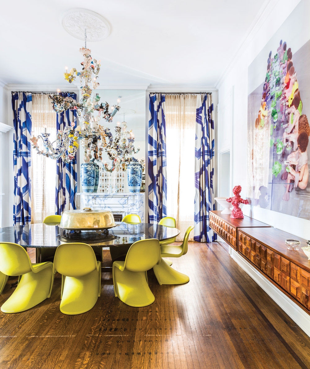
It all started with a chandelier, a massive work by Francesca DiMattio that the designer and her husband, Javier Loya—who heads energy commodities broker OTC Global Holdings and is part owner of the Houston Texans football team—purchased from Salon 94 in New York. “It’s got so much personality; every single piece was handmade and painted,” she says. The couple—avid art collectors—had just bought the Louisville home and decided to install the piece in the dining room. “Once that happened, I started changing my thought process, like, I’ve got to amp up this room if I’m going to have that in another room,” she says.
That proved the catalyst for her causal approach, with one decision leading to the next and the next. She gave herself specific parameters: The palette would be aged and muted, with each color used represented in some form in every room, and most objects would originate from the period between the year the home was built and 1976, the year she had moved away from the area at age 12. (She did make allowances for a few antiques and ultra-contemporary works, such as the chandelier.)Throughout, she strove for “a sense of humor and a warm, cozy, welcoming approach,” one that would take her back in time to her upbringing. As part of this, she embraced the design world’s unloved. “When I would flea-market shop, I’d ask myself: Is this ugly enough?” she laughs, recalling the citrus-green shag carpet and kidney-shaped ashtrays of her childhood. “Does this remind me of my mom or my grandma’s house? Yes, it’s so ugly, but it’s so good.” Loya notes that it was a deeply emotional process. “I felt my head spinning a lot, but I stayed true to my concept, which is why it all worked,” she says. “I would ask myself: Is this vintage enough, does this serve the purpose, does this send the message, does this make me feel nostalgic?”
 The porcelain in the chandelier got Loya thinking about her grandmother’s blue-and-white china, but rather than expand on that theme in the dining room—“so cliché,” she says—she chose to bounce it into a ground-floor bedroom, which she slathered in cobalt Azulejos wallpaper and drapery by Christian Lacroix. “That’s exactly the way I decorate all homes,” she says. “If the color’s in one room, let’s put it in another room, but tweak it, make it smaller. Same with pattern, so because the chandelier had a lot of blue-and-white porcelain pattern to it, I thought it was fitting to put it in a room nearby and go crazy with it.”Back in the dining room, the drapes pick up the colors in a larger, contemporary scale. The ’60s and ’70s are hinted at in the chartreuse Verner Panton chairs and the warm tone of the wall-mounted sideboards from Global Views. “Normally I wouldn’t like the color of that wood,” Loya says, “but in this house I broke so many rules of my design aesthetic.”
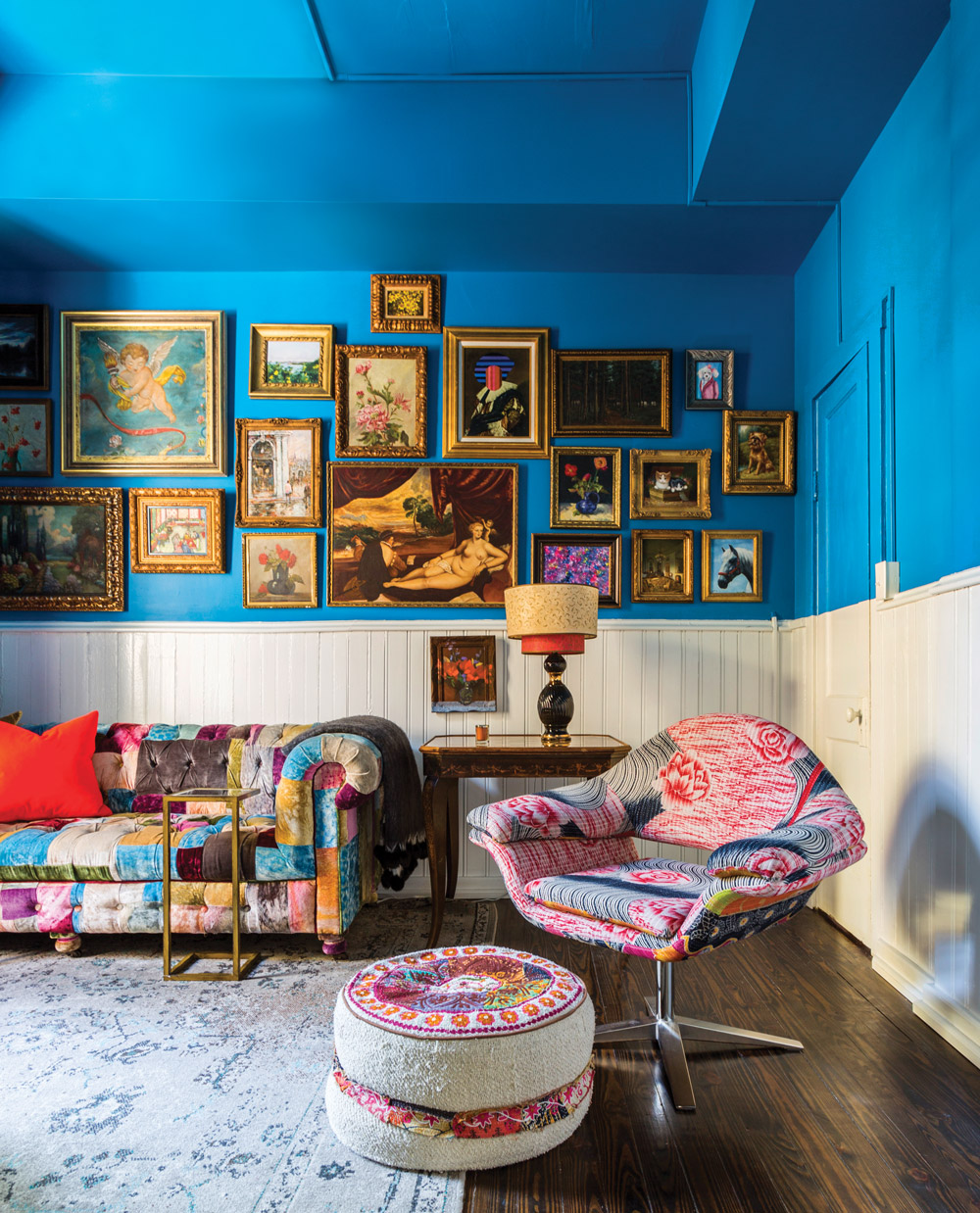
The juxtaposition of old and new lends the home a sense of timelessness. In a second-floor living room, a traditional collage wall of flea-market paintings, all in ornate gold frames against bright blue walls, shares space with a midcentury modern Italian chair, covered in vintage quilting fabric. For the main living room, Loya sought to re-create a classic hotel lobby—or at least, one as she would have imagined it as a child. “I didn’t see a lot of hotel lobbies back then, because I was a welfare child with a single mom,” she says. Unable to settle on a mural or the right piece of art to go over the custom tufted velvet sofa, she chose a radical direction for the wall treatments. “I researched that gold-veined mirror from the ’70s that everybody did and was super cheap. Well, today it is a crazy fortune. And it didn’t seem to make sense to just do it on one wall anymore, so then I had to do it on all the walls.” That decided, she splashed color on the floor, opting for Alexandra Champalimaud’s Stingray Red from The Rug Company. Its spiky shapes mirror those of the crystal Spider chandelier above.
The bourbon room is where the Loyas spend most of their time. It’s dominated by a joyful photograph of a Cuban woman by Leif Wivelsted, overlooking cognac-colored leather armchairs, a French settee and Javier’s collection of the room’s namesake spirit. The zebra rug, Hermès ashtray, Ralph Lauren throw and collection of Kentucky Derby hats are among many objects in the house that nod to the area’s equestrian roots. For a small-town girl who saw Louisville as the big city, this room would have been the embodiment of sophistication; for the Loyas today, it’s a statement on background and heritage, told with elegance and wit. Lucinda Loya Interiors, lucindaloyainteriors.com
Save
Save
Save


