BOLD
STROKES
Interior Design: Raji RM & Associates
Text: Jorge S. Arango
Photography: Rikki Snyder
A significant generational design shift continues apace in the nation’s capital. “We’re seeing an influx of younger and more diverse people moving back to D.C.,” says On Lu, the owner of a condo conversion of a quintessential 1900s Georgian-style brick house. “They’re bringing with them a dynamic and energetic style that contrasts and adds to the more traditional D.C. aesthetic.”
Lu is a case in point. A peripatetic fortysomething tech lawyer of mixed Asian descent, he needed an interior designer to conjure a pied-à-terre that reflected this youthful global perspective. The obvious choice? Raji Radhakrishnan of Raji RM & Associates. “Raji is less Georgetown and suburban Maryland, and more Paris, New York and Shanghai,” says Lu. Their resulting collaboration yielded unexpected surprises for both. “His main direction to me consisted of two words: bold and beautiful,” recalls Radhakrishnan. “He loves color and he has a natural exuberance. His attitude was, ‘Throw anything at me.’ I have to thank him for moving me beyond my own comfort zone.”
“My immediate instinct was to go graphic,” she continues. This manifests most vividly in the living room’s “café nook,” where Radhakrishnan paired Philippe Starck Mademoiselle chairs upholstered in a Mondrian-esque fabric with one of the crisp black and white rugs from her own Raji RM Artist Series. Her inspiration for the fabric (found on Etsy) actually came, she notes, from a famous dress by fashion designer Lisa Perry. A blocky serigraph by Lucienne Olivieri and a Calder-like mobile overhead complete the vignette. The contrasts are starkly arresting, the colors straightforward and primary. There is no equivocation in this composition, which spiritedly confronts the viewer with an insouciant “take it or leave it” assurance.
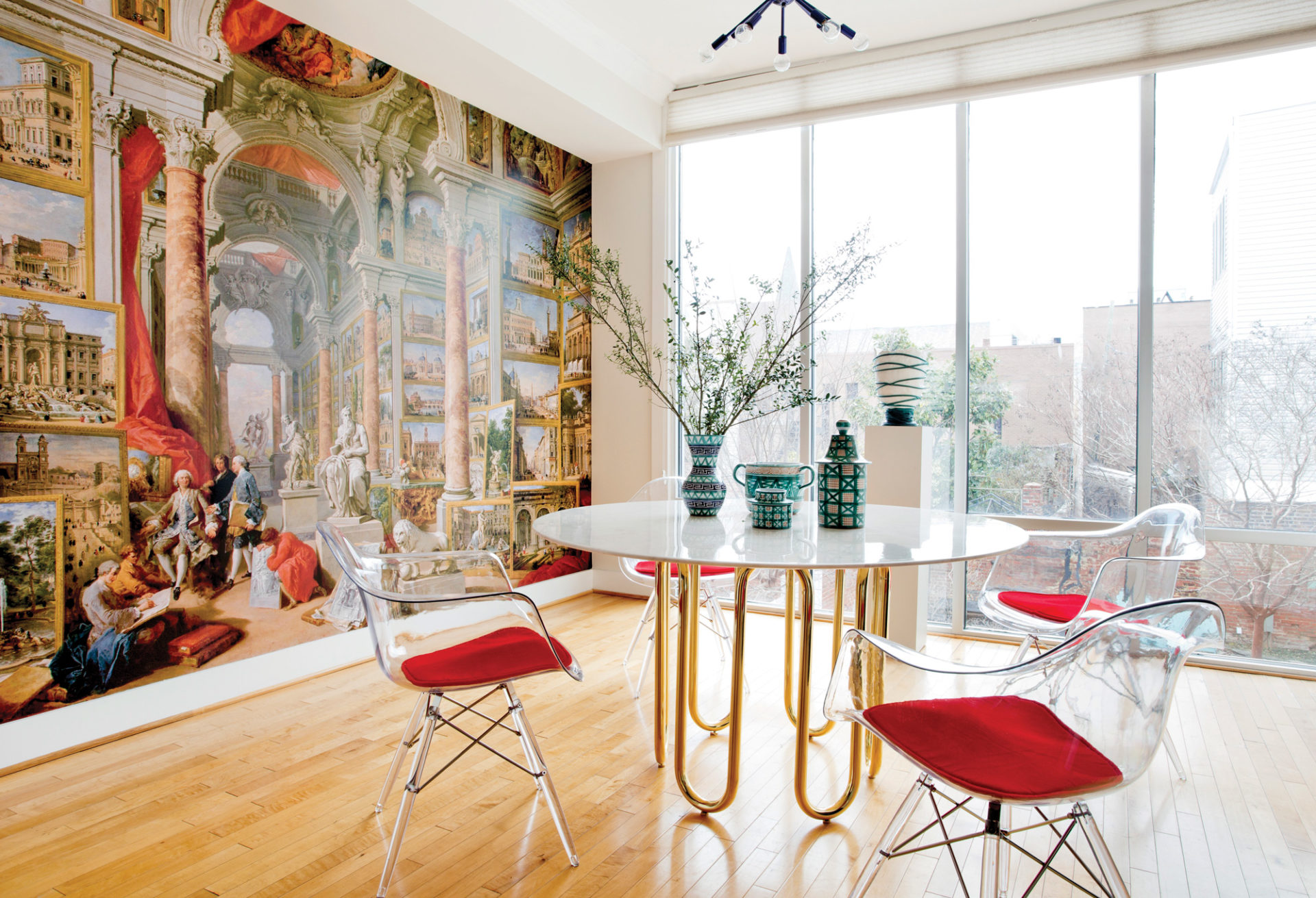
“She and I did battle on several fronts,” says Lu good-naturedly. Naturally, differences of opinion are not unusual inside the Beltway. Fortunately, however, the debate here was anything but fractious. For instance, intending to continue her graphic thread, Radhakrishnan had proposed a geometric wallpaper by Mariska Meijers for the dining room. But, says Lu, “I insisted we use a mural from Raji’s collection since that is one of the hallmarks of her style.” Indeed, a Radhakrishnan signature is often the high-impact use of classically themed murals drawn from art history and computer manipulated, then reproduced onto a wall in outsize scale. The actual image Lu chose from her collection is based on a 1757 Giovanni Paolo Panini oil painting that hangs in New York’s Metropolitan Museum of Art. (The Meijers wallpaper found its place in a guest room.)
Radhakrishnan admitted that the original wallpaper “would kind of just sing the same song as the rest of the apartment. This is what gives the place his personality. It’s the unexpected quirkiness that makes it come alive.” And it certainly sparks an intriguing tension against a brass Jonathan Adler dining table topped with 1950s Robert Picault ceramics.
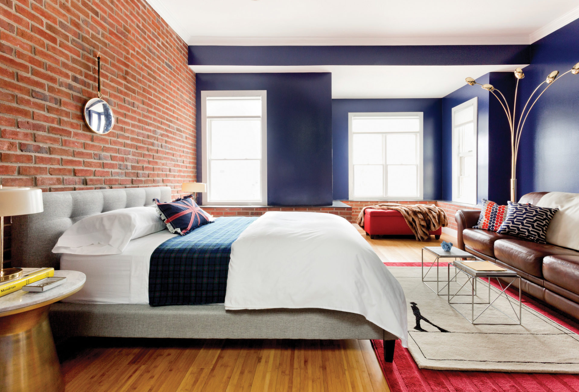
The designer nudged her client out of his own comfort zone too. “I’d find myself pondering, ‘What could she have been thinking?’ ” Lu says. “Like the rug-on-rug layout in the master bedroom or the random white ceramic collection on the dining room fireplace.”
“I didn’t want to clash with the artwork of the mural,” says Radhakrishnan of the latter assemblage, “so we created an arrangement of white ceramics that functions as an installation.” This intriguing lily-white olio of vessels and sculptures invites contemplation, but also partially disappears against an equally snowy white wall.
This sort of push-and-pull pervaded the project, always ending in unexpected juxtapositions and interesting solutions. Lu was skeptical about a Fromental paper of multicolored large-scale triangles overlaid with a pattern of wispy clouds. It eventually ended up on the wall by the staircase. But then, Radhakrishnan says, she would “never have chosen a Chesterfield sofa” to sit in front of this wall. The classic seating did allude nicely to D.C.’s more traditional, historic vibe however, and covering it in bright-red velvet from Cowtan & Tout cast it against type, imbuing it with the contemporary flair the apartment demanded.
Practical concerns also drove choices and, as elsewhere, led to unusually harmonious bipartisanship. Take the seating: A vintage Corona chair by Poul Volther for Erik Jorgensen unearthed on 1stdibs “practically screamed at me,” Radha-krishnan remembers. “But he also needed something comfortable with arms. Seating can’t be universal for everybody, because body types are different. You want people to gravitate to the chair that’s most comfortable for them.” Solution? To the existing pairing of Chesterfield sofa and Corona chair, Radhakrishnan added a vintage Hans Wegner Papa Bear chair, also from 1stdibs. The final outcome proves how innovation and functionality can arise out of healthy discourse. Raji Radhakrishnan, Raji RM & Associates, rajirm.com
Save


