Published as:
 Forever Young
Interior Architecture: SPAN Architecture
Interior Design: Stacey Gendelman
Text: Jorge S. Arango
Photography: Scott Frances
Since the Astor family erected the Apthorp in 1908,
it has been recognized as one of Manhattan’s grande dame apartment buildings. Nora Ephron, who lived “in a state of giddy delirium” at the Apthorp (along with neighbors Al Pacino and Cyndi Lauper), wrote in The New Yorker, “From the street, it’s…solid as a tanker, but its core is a large courtyard with two marble fountains and a lovely garden. Enter the courtyard, and the city falls away.” But like many a grande dame—whose imperturbable, even imperious surface belies a gracious heart—the building needed a youthful revival.
Normally the job of reworking this 4,300-square-foot apartment—comprised of two combined units and a hallway from a third—would fall to an architect (in this case, SPAN’s Jean-Gabriel Neukomm), and the final touches would be the task of an interior designer (here, Stacey Gendelman, who had decorated the home of the owners, empty-nester neighbors living near her in Westchester). In truth, however, the division of labor wasn’t so clean-cut. Everybody, including the owners and Elliot Berkowitz of Riverside Builders, had equal say. “The deal was that if somebody felt strongly enough about something, we wouldn’t do it,” Gendelman says. “The whole team went shopping.”
The question Neukomm asked himself as demolition began was, “How do you keep to the soul of the building and not make it a historical piece?” His answer: A floor plan of graciously proportioned spaces—including three bedrooms—that straddled the line between the couple’s varying needs. The wife desired something respectful of its original stateliness where they could gather with children and friends. “I’m an observant Jew,” she says. “Everything is about family.” For the husband’s part, he yearned for a sexy Tribeca loft where he could retreat four nights a week after working in the city.
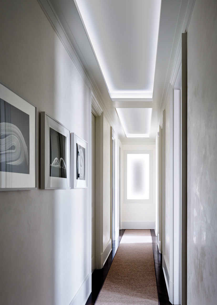
Detailing became the vehicle for achieving that balance. “We created moldings that were more like simple lines or bands; very subliminal,” explains Neukomm of the clean, modern way he referenced the Apthorp’s turn-of-the-last-century affect. Also to this end, he marked transitions from room to room with deep, tall thresholds where doors pocketed into the walls. “When you have an apartment with rooms of this scale, you don’t want to just pass through a six-foot door,” he says. And he asked I.J. Peiser’s Sons to execute chevron-patterned floors, a labor-intensive feat that takes them to a level above the regulation herringbone of the period.
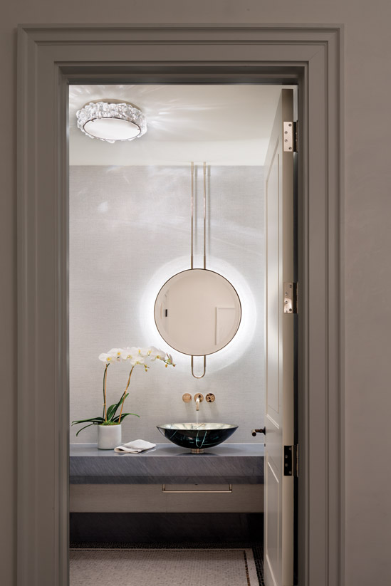
 “I was adamant about keeping the entry floor,” remembers the wife of the ornate mosaic in the original, weirdly elongated octagonal foyer. It was, however, damaged beyond repair, so the team re-created it in a simpler form using an Artistic Tile mosaic tesserae of Bardiglio, Carrara and dark Emperador marbles and black onyx. A complementing mosaic continues into the powder room under the AFNY vessel sink and Corona light fixture from C.L. Sterling. The fixture’s material echoes the rock crystal of the custom chandelier from Wired that hangs over a Hudson International hall table in the entry.
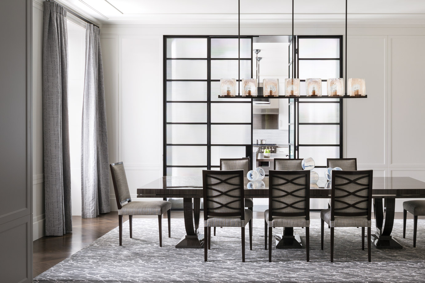
To address the husband’s more downtown vibe, Neukomm separated kitchen and dining room with steel-framed glass doors. For the doors, he says, “Ribbed glass felt more historical.” In the dining room, the bespoke table in African Tay Koto veneer and its companion chairs—all fabricated by Artistic Frame—evoke understated Art Deco silhouettes, while Fuse Lighting’s London chandelier from Dennis Miller Associates picks up on the industrial chic of the steel doors. The wife adds that she has comfortably seated 24 here.
The doors are set into a blackened steel portal, a material repeated in the kitchen pendants from C.L. Sterling that illuminate an island of white Vermont quartzite from Everest Marble in Norwalk, Connecticut. “A year before we started the project, I was at a quarry for another client and saw this stone,” Gendelman says. “I said, ‘That’s it!’ So I bought it and had them store it.” Porcelain wood-look “planks,” discovered at Town & Country Flooring, further convey the converted factory loft concept, but Gendelman brought in the Bardiglio and Carrara marbles of the foyer for the backsplash.
The minimalist detailing also pervades the wood-paneled library. “We must have looked at three dozen small samples before deciding,” Gendelman says of their choice, Innovations Haku wallpaper covering the cove ceiling. The team cut it in pieces before applying it to resemble a metal leaf. Its “pale rose” colorway warms the light that bathes the Jean de Merry parchment-and-bronze coffee table and the custom desk and chair from Hudson International.
“The apartment is about texture,” Gendelman says. And certainly, bearing this out are custom wool-and-silk Beauvais carpets throughout, marbles, chunky rock crystal fixtures and a diverse panoply of fabrics—from mohair-covered Holly Hunt Carpo chairs in the living room to the master bedroom’s Cowtan & Tout cotton-silk Larsen drapes and the Altura Arris bed’s rustically woven Designers Guild Iona fabric. But the apartment is also about how a modern approach can usher a classic residence into a new age—proof of this grande dame’s eternal youth. – SPAN Architecture, 212 732 7012, span-ny.com; Stacy Gendelman Designs, 212 714 8722, staceygendelmandesigns.com


