Published as:
FLOAT LIKE A
Butterfly
Architecture: Filoramo Talsma Architecture
Text: Tate Gunnerson
Photography: Cynthia Lynn Kim
 There are so many delightful little moments in this project,” says designer Jennifer Kranitz of the 47th-floor Gold Coast entertaining lounge and guest suite that she, designer Aimee Wertepny and architect Chris Talsma designed for a couple with three young children who reside in a spacious dwelling one floor below. Indeed, after buying two units above them, the homeowners commissioned the trio to combine the spaces, rattling off a long wish list that included areas for entertaining, a yoga studio and a children’s playroom.
For inspiration, the designers looked to the unit’s pie-shaped floor plan. “The architectural language was very angular with lots of faceting, and we carried that throughout,” Kranitz says. “We also wanted to find ways to soften that language a bit, to make the space feel approachable and laid back.” Built with angled Belgian quartz slab steps along the bottom and floating walnut ones near the top, a new stairway leads from the owner’s unit to a spacious lounge outfitted with triangular porcelain tile flooring from Transceramica. Along one wall, a solid Kenya Black marble bar with graphic black and white veining also echoes that shape. “It draws the eye and makes that area feel special,” Kranitz says.
A sinuous, three-dimensional wire sculpture by Chicago artist Eric Gushee likewise commands attention above the custom sectional on the far side of the room, with pillows covered in fabric by Mokum. The graphic wool and silk rug from Organic Looms and a coffee table from Phillips Collection feel like artwork. A Lucite swing with a Mongolian fur–covered seat by B. Pila adds a touch of whimsy. “That’s the experiential part of our design aesthetic,” Wertepny says. “We’re crazy for the furry, gnarly, tattered and textured pieces.”
She points to the pair of rattan and wood Guernica chairs with leather fringe by Laura Kirar for McGuire, which face each other and flank resin stools by Martha Sturdy. And near the windows, a sculptural black wooden table from Noir is surrounded by a mix of casual, even rustic, stools and chairs. After all, the owners already have a formal dining room downstairs. “The idea was to do an assembly of casual chairs that could be scattered throughout,” Kranitz says.
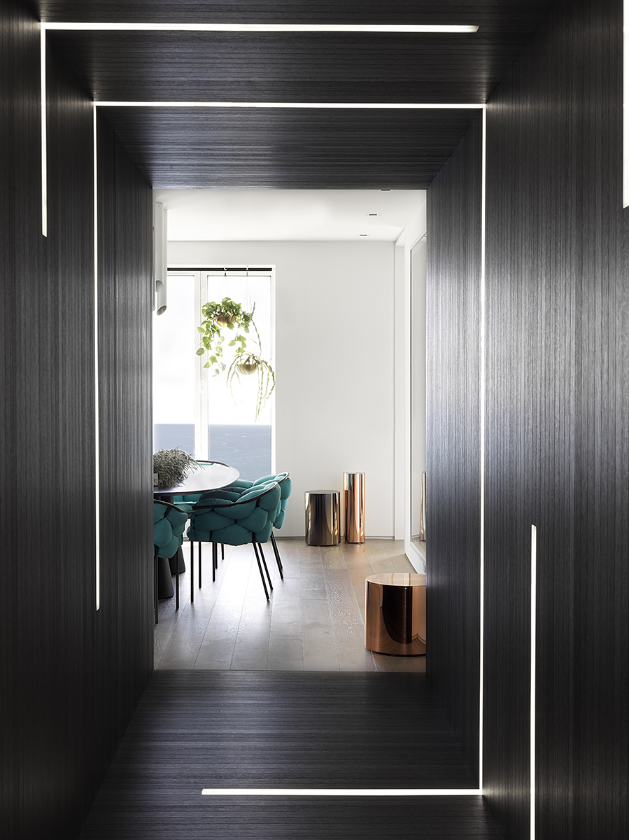
The monochromatic space is open to a long gallery with white walls punctuated by vibrant pieces from the couple’s art collection, including a pair of iconic Muhammad Ali portraits by Andy Warhol. The gallery also separates the home’s public and private areas, which are accessible via a trio of portals clad entirely in opaque ebony-stained oak boards interspersed with glowing LED panels. Walk through the corridors, and the bulbs automatically turn on. While there is no hardware to give them away, the dark paneling also conceals doors to storage closets, an AV room and two bathrooms, including one with black walls and dark accent tile from Ann Sacks. Accessorized with a bike chain sconce from Facaro and miniature booze bottles, “It’s moody and cool, a space for grownups,” Kranitz says.
A kitchen lies at the end of one corridor, although the designers downplayed its functionality, incorporating back-painted glass cabinetry by Valcucine with a smoked mirror backsplash. In the center of the room, a mod chandelier by John Beck Paper + Steel illuminates not an island but a black steel conference table surrounded by a set of tufted chairs in a bold teal hue from Ligne Roset. “We didn’t give it the credence of a proper kitchen,” Kranitz says. “It’s subtle and in the background but with every appliance that you’d ever need.”
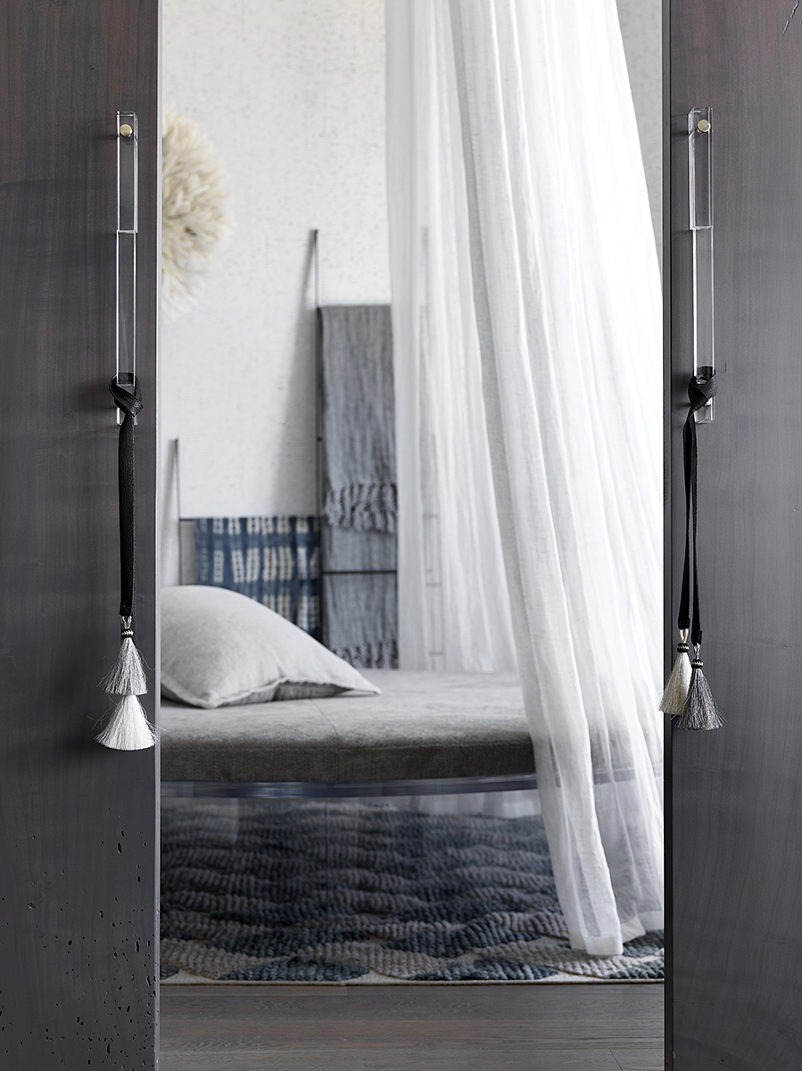
Another hallway accesses the more private areas, including a guest suite, a yoga studio and a meditation room. There, draped in linen sheers, a circular Lucite bed atop a textural Tufenkian rug faces the lake. “It’s as if you’re floating high in the clouds,” Wertepny says. “It’s the most peaceful, serene, ethereal experience.” The guest bedroom is equally ethereal, its walls concealed behind hand-dyed curtains by Gina Dorough of Surface Studios, which disguise the smallish windows. The airy vibe is echoed in the spa bathroom, an elegant space that boasts a round soaker tub atop a faceted platform. A graphic wallcovering from Area Environments adds a splash of color inspired by the watery view.
Naturally, the new entertaining pad more than lives up to the owner’s lofty expectations, and they have already hosted many lively soirees in the space. Kranitz and her daughter attended a children’s birthday party there shortly after the project wrapped up, and the designer was thrilled to witness multiple generations comfortably interacting just as she had imagined. “Seeing the space come to life was so gratifying,” Kranitz says. “It was magical.” PROjECT, projectinteriors.com; Filoramo Talsma Architecture, filoramotalsma.com.
Save
Save
Save


