Make It
POP
Architecture and Interior Design: William Hefner
Text: Abigail Stone
Photography: Laura Hull and Richard Powers
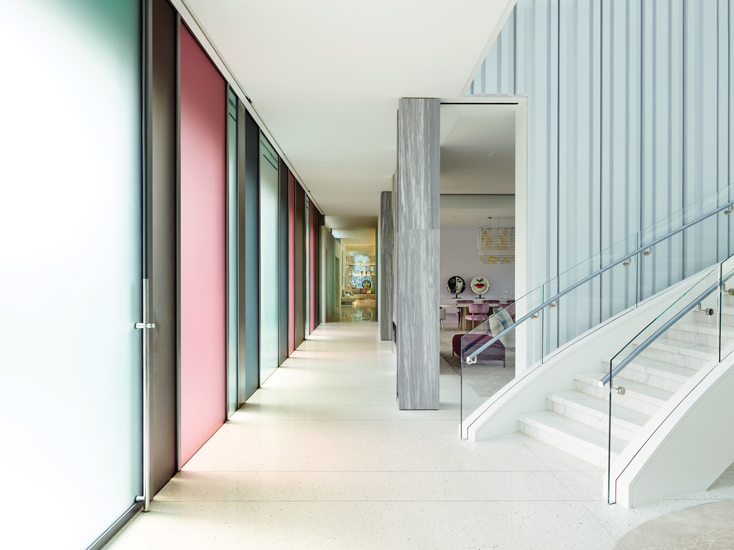
Seen from the road at night, with the light seeping through, the home seems to be a simple two-level structure. It’s only during the day that it begins to reveal its coquettish game: the main building’s lower level a pastiche of frosted polychrome rectangles in muted Easter candy pastels that screen the interior from the street; above, a louvered steel covering around the second floor winks in the sun. That impression of whimsy is courtesy of its architect, William Hefner.
“There’s a playfulness that rolls through the whole house,” Hefner says, “The husband said, ‘We don’t want a regular house; we’re looking for something out of the box. What that is, I leave to you. Do what you want.’” That license, granted to another architect, might have resulted in an overtly flamboyant construction that channeled the upside-down pyramid the client shared as an inspiration image. Instead, Hefner, elegant in both his speech and his approach to design, began with what he knew of the clients, a European couple with a teenage son, sketching out a floor plan that spoke to their needs.
“It was initially designed as a summer residence,” Hefner says. “Second residences tend to be easier because they don’t have to be strictly functional. They’re more about entertaining and fun.” They’d need guest quarters that would support extended visits from friends and family. He also knew they wanted a modern home. “It’s inconceivable [to Europeans] that you would build a new house in a traditional style,” he says. “But, because of the wife’s influence, it wasn’t going to be one of those concrete and glass white boxes with black furniture.” And he noticed that every time he visited the clients, they were enjoying the outdoors. “Whether it was 10 in the morning or 8 at night, they were outside, so I knew that had to be very well considered.” Hefner wove this intel into the principles that have guided his firm since its inception: an ability to bring intimacy to large-scale residences, a viewpoint that melds classical traditions with modern concepts, and an understanding of how to maneuver a seamless transition between indoors and out. “I think the site plan was the carte blanche here. My idea was to make it more of a compound than a house,” he says, “I feel like the challenge is to listen to what people are saying and then read between the lines for what they really want and then try to build the house around that.”
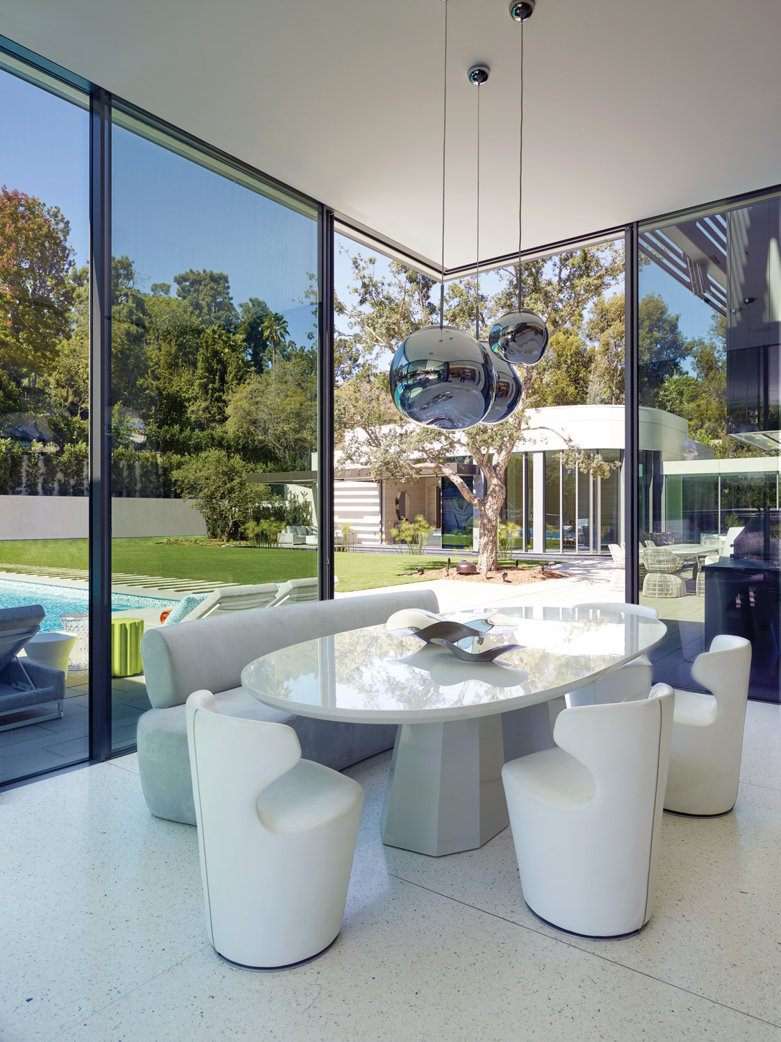
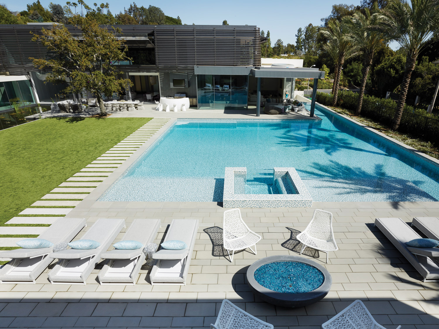
The focus on relaxation is telegraphed by the pool’s location at the center of the property. “They’re coming here as a summer place, so of course, you would have a big pool,” says Hefner. “Because it’s like a hotel, we sized the pool to be hotel-sized.” Augmented by a 25-foot-long swim lane as well as a hot tub, it’s covered in a puzzle of hexagonal glass tiles in white with blues and golds that mimic the sparkle of sunlight, shimmering with movement even on cloudy days. Around it swirl a trio of spacious, light-filled buildings—a guest house, the main house, and a third structure, accessed by a covered glass bridge, which leads across a companionate lily pond, that houses the master suite—ensuring accommodations for up to two dozen guests and forming a barrier against the outside world. “Everybody has their private area and then they meet in the public spaces,” notes Hefner. Anything devoted to work—the husband’s office, the working kitchen, a garage that accommodates the family’s large collection of cars—is secreted away. The mudroom, typically the workhorse of the home, becomes a captivating destination: Artist Emma Rios was commissioned to paint the space just outside the garage and the home theater, which she envisioned as two blue eyes peering out from behind draperies. Hence, says Hefner, “It’s theatrical.”
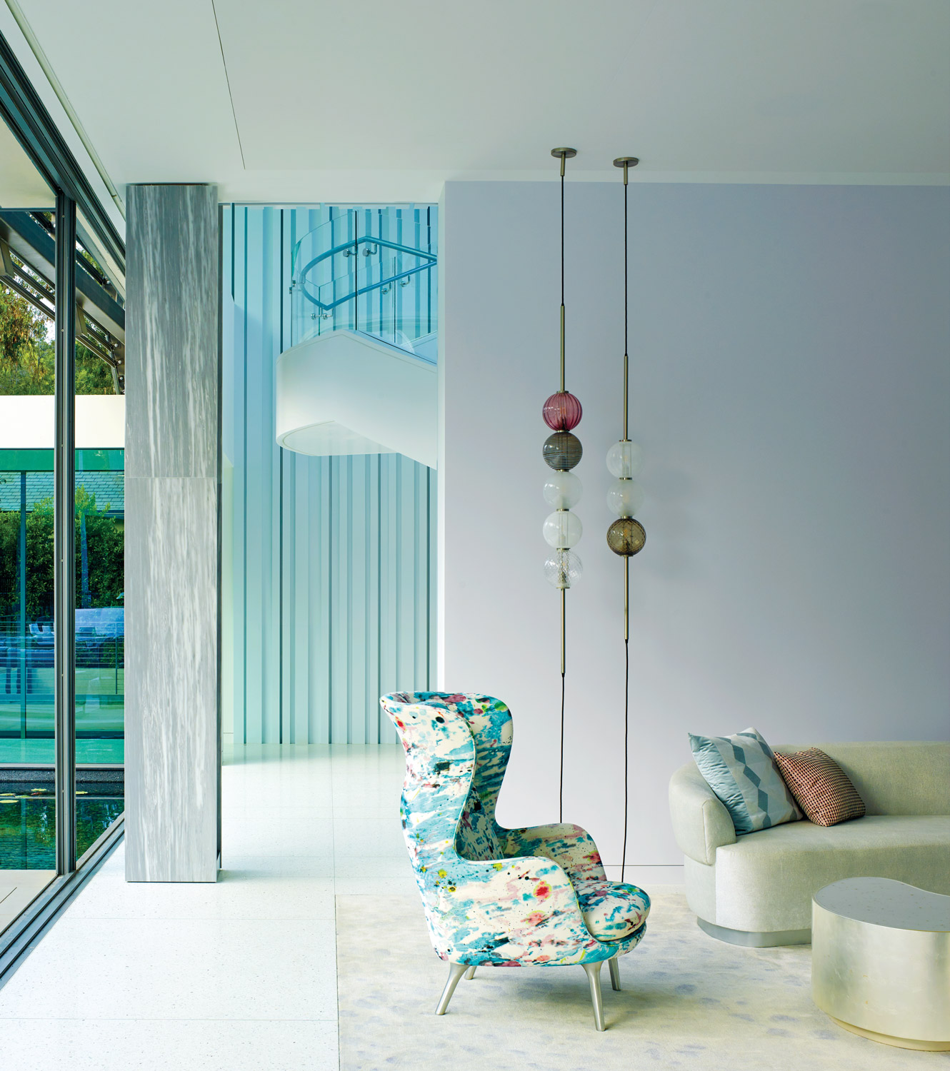
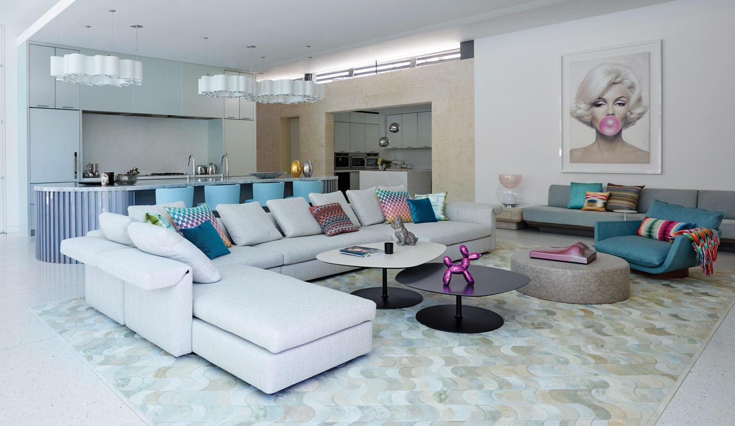
Despite the home’s obvious grandeur, it feels welcoming and intimate. “We start with the scale of one room and how it all feels,” Hefner says. “In this case we tried to not have it all blown out to where all these rooms would be open to one another, because then it wouldn’t feel like you could sit down and have a conversation.” Glass pocket doors fully open the high-ceilinged first floor to the exterior. “The entire site becomes the living space,” Hefner says. That’s underlined by a dozen outdoor areas, including a fire pit and a barbecue. “You move to follow the light throughout the day.” The interiors, spearheaded by Hefner’s wife and partner, Kazuko Hoshino, pull that sun-soaked exuberance inside. Subtle nods to Old Hollywood tint the space with lively glamour—pale walls touched with a drop of rose, curvaceous furniture, mirrored surfaces, plush rugs, glittering light fixtures, joyous splashes of aqua, lavender and pink, a sparkling terrazzo floor embedded with mirrors and abalone shells and bright, animated art, including Michael Moebius’ photos of Audrey Hepburn and Marilyn Monroe blowing bubble gum.
The home’s effervescence crests in the front entry’s show-stopping staircase. A sensual, sculptural twist of marble and Lucite lit during the day by a skylight high above its atrium, it roars to life with the flick of a switch, its treads illuminated to dazzling effect. “We just tried to make the house as much fun as we could,” says Hefner. That he succeeded can be seen in the house becoming the family’s year round retreat, a temple of worship to Los Angeles’ promise of an eternal, playful summer vacation. Studio William Hefner, williamhefner.com
Save
Save
Save

