Published as:
For All Seasons
Interior Design: Marc-Michaels
Text: Zlata Kozul Naumovski
Photography: Jessica Glynn
Designers and builders alike thrive on customer referrals and repeat clients. So Marc Thee was thrilled when clients who lived in a home he designed in Boca Raton, Florida, for builder Mark Timothy engaged him to design their new build, by Brenner Architecture Group, only three doors down from their current dwelling. Not only did they choose the same designer, they also enlisted the same builder to create their dream home. “They realized they needed a bigger place,” says Jessica Lee, senior project manager of Marc-Michaels Interior Design. “They liked the cleanness and contemporary style of their home and found a lot so they could build from scratch and get everything they wanted.”
Getting everything they wanted included a massage room, ample outdoor space and plenty of wall space to showcase their growing art collection against a neutral background. Overall, the couple—a retired surgeon and a business executive—requested a cleaner look and more white. “Since we already designed a house for them, we had a lot of feedback on things they wanted to do differently and what they liked,” Lee says. Their first go-around featured a lot of wood, a design element they appreciated. “They liked the warmth of the wood, but combined with the feel of a contemporary home,” Lee says.
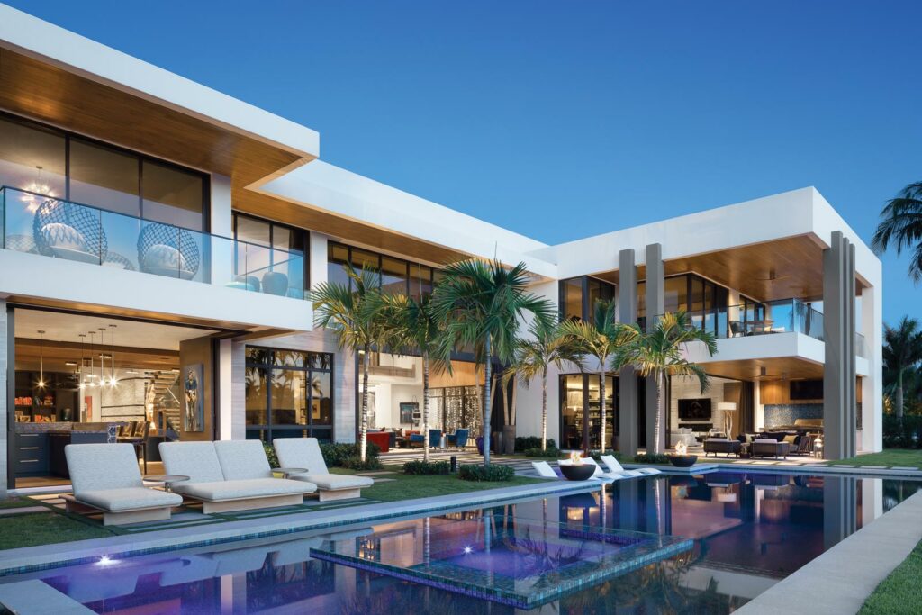
It’s easy to see why the clients didn’t venture far from their previous pad. Two stories of modern architecture in a picturesque community open onto the Intracoastal Waterway. Balconies and a cypress ceiling loggia outfitted with furnishings from the Holly Hunt showroom in Miami overlook a clean-lined swimming pool and the inland canal. Chaise longues from Kettal and chairs from Janus et Cie beckon homeowners and visitors to sit and enjoy the perfect climate and the landscaping by Peterson Design Professionals. A front door of glass and live-edge walnut gives off the warm but contemporary ambience the clients desired.
Inside, expansive sliding doors recede, eliminating any obstruction to the views. Walls were intentionally kept white, the better to showcase the couple’s original art. “They have a modern aesthetic and a great art collection,” Lee says. Two especially vibrant pieces take pride of place in the foyer: Pink to Purple and Rainbow by Zhuang Hong Yi purchased in Paris from Modus Art Gallery in Place des Vosges. “From the moment we saw them we knew where they were going to go,” Lee says. “As you walk past, they change colors, and the colors in the living room relate to them.”
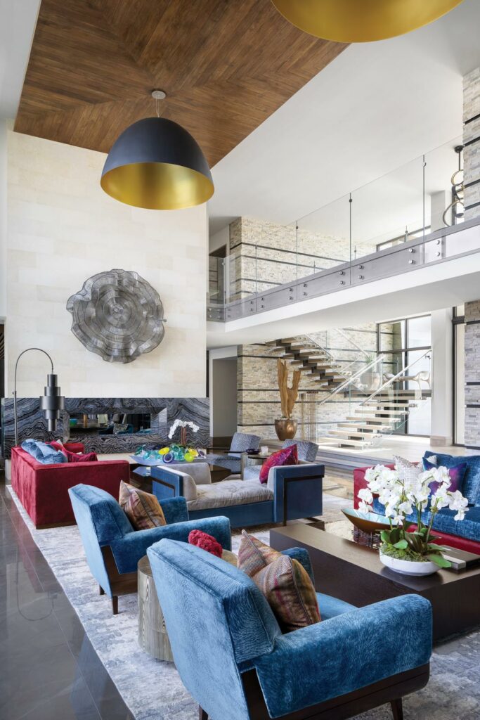
Inspired by the pieces, a pair of Hellman-Chang swivel lounge chairs beckon in blue; custom sofa frames are upholstered in a ruby red, while seat and back cushions wear a bright indigo from Romo. This carries to the lounge chairs, which pull up to a cocktail table in dark wood from Holly Hunt. Meanwhile, metals make an appearance in the living room to contrast all the soft furnishings. Black and gold pendants six feet in diameter draw the eye up to the nickel-joint, oak-covered ceiling. Designed by Ingo Maurer, they were easily approved by the clients. “They have such a good aesthetic and they really get it,” Lee says. “When we showed the fixtures to them, they absolutely loved them.”
Avid entertainers, the clients requested a dining room table that would accommodate the most number of guests possible. The design team enlisted Mark Jupiter to build a table in a custom width of 54 inches, which would allow two Randolph & Hein chairs at the ends. Picking up on the finishes in the living room, the tabletop is dark walnut and bases are brass. Book-matched slabs of stone on one wall offer a dramatic contrast to the Serip light fixture. Inevitably, when feasible, dinner parties will spill over into the nearby bar, where A. Rudin barstools offer lovely perches from which to look out onto the waterway.
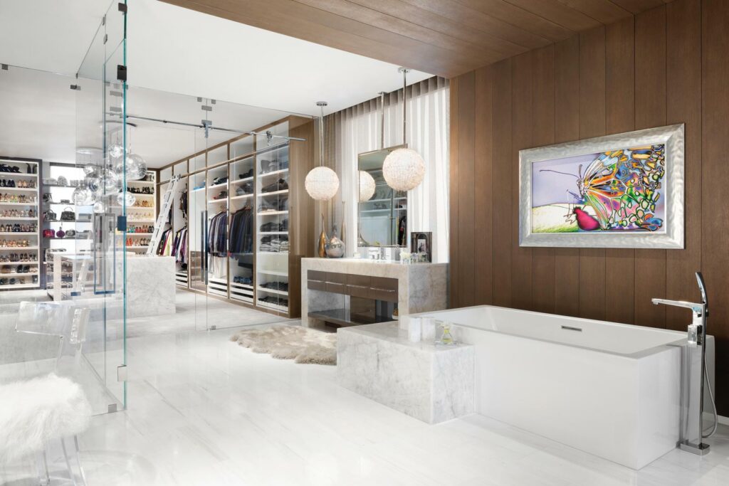
Bedrooms upstairs are equally chic. The master bedroom coddles somniferous occupants with a headboard wall composed of leather panels in a creamy palette and a double-sided floating mantel and fireplace. Reading as one contiguous space, the master bathroom bleeds into the master closet, with glass doors demarcating the separate functions. A guest bedroom embraces reflective surfaces with nightstands by Bernhardt stationed in front of mirrors and below pendants in a mirror finish. A favorite piece of art by Juliana Duque, chosen for its vibrant colors, surmounts a bed by Bernhardt upholstered in a Brentano fabric.
During the day, the home basks in natural light, but when the sun sets and the ambient lighting turns on, the vibe changes. “At night, it’s really moody and that’s exactly what they wanted. They wanted it to be a little clubbier, a bit sexier,” Lee says, citing the metallic accents, plush textiles and dark finishes. Regardless of the hour, the clients added their personality to everything Thee did, and use every square inch of the house. “They’re in the pool, they use the massage room,” Lee says. “They really live in the house.” Marc-Michaels Interior Design, marc-michaels.com


