Published as:
Side by Side
Architecture: Eric Olsen
Interior Design: Bonesteel Trout Hall
Text: Jeff Turrentine
Photography: Karyn Millet
For close-knit adult siblings with large families of their own, the idea of living next door to one another—combining households, as it were, but with just enough space between homes to allow for separation and privacy when needed—has an undeniable appeal. In Birmingham, Michigan, architect Eric Olsen and designer Heidi Bonesteel, of Bonesteel Trout Hall, recently helped a pair of sisters make this dream come true.
Like Olsen and Bonesteel, the clients—a married couple with six young children—are based in Southern California. But the wife grew up in this handsome Detroit suburb, which her sister still calls home. “The property next door to the wife’s sister happened to come onto the market when the clients were out there for a trip,” says Olsen. In a snap decision, they bought it. And before long, two sisters, two husbands, and 10 school-aged cousins were spending their holidays and summer vacations living side by side in a pleasantly buzzing extended-family compound.
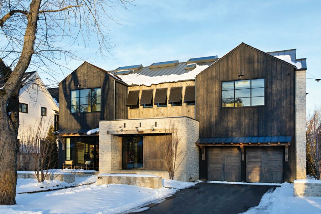
The clients envisioned a house “that not only they would use, but that the other family would use, too,” says Olsen. Having worked with the couple before on other projects, he was able to draw from a well of implicit trust in designing a home that would be architecturally related to its contemporary, all-white sister property next door, yet also distinct. That meant doubling down, so to speak, on a modernist facade in a neighborhood where traditional styles tend to dominate. But Olsen and his clients tempered the effect by opting for a darker palette and earthier materials—reclaimed wood, dark-stained cedar, and limestone, for example—that combine with the double-gabled roof to create something like a modernist farmhouse.
Any rusticity, however, stops at the front door. “The wife gravitates toward midcentury,” says Bonesteel, who fortunately shares her client’s affinity. On an early trip to the site, the designer was thrilled to learn that the Cranbrook Academy of Art, where so many midcentury modernist legends taught and studied, was just a short drive away. A visit to that hallowed ground, combined with impressions made during a previous visit to the Stahl House in Los Angeles—better known as Case Study House #22, a bonafide midcentury masterpiece—sparked an idea.
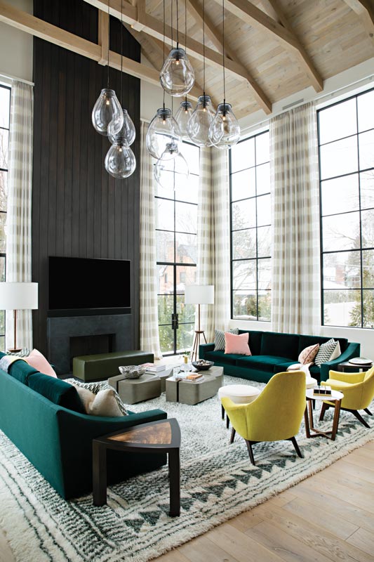
Among the furnishings Bonesteel spotted that day at the Stahl House were a set of molded Herman Miller chairs in bright yellow. “I was just so drawn to them, but I didn’t know where in the world we could end up using them. It was serendipitous, though, because it was about the same time that we were starting to put together the scheme for this house.” She showed the clients images of the chairs, Bonesteel says, “and they loved them.” She began developing a scheme for furnishings, colors and materials that would borrow respectfully from the vocabulary of midcentury modernism, but update it accordingly for a family of today. The chairs proved to be “an easy jumping-off point,” she says, “and things just kind of went from there.”
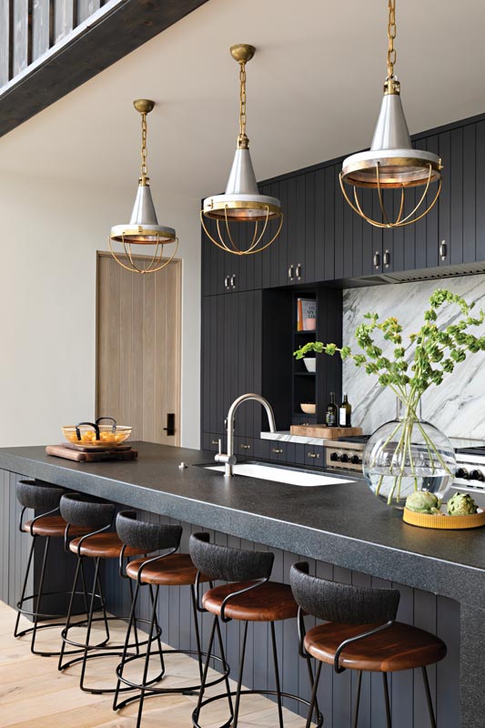
Enveloped on three sides by 20-foot-high windows, the great room, which comprises a kitchen as well as living and dining space, pays homage to Bonesteel’s original flash of inspiration by surrounding the Altura dining table with 10 molded fiberglass armchairs designed by Cranbrook icons Charles and Ray Eames—bright yellow, of course. Just steps away, soft pink pillows on a pair of custom Bonesteel Trout Hall sofas covered in a deep emerald Pindler fabric extend the feeling of vintage playfulness into the living area. In a different space, the color combination might have come across as over the top. “But because Eric gave us so much volume, it’s not overwhelming,” Bonesteel says. “If we had done a neutral palette—which I also love, by the way—it might have come across as washed out.”
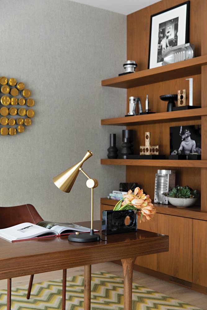
In nearly every room of the house, neutrals are punctuated by one or two flashes of vivid color, powerful and much-needed reminders that the world we live in isn’t all tan, cream and slate. In the office, green and yellow zigzags course through the off-white plane of a Merida rug, while a lemon-yellow throw pillow looks on approvingly atop a vintage armchair purchased at an estate sale. Here, as elsewhere throughout the house, contemporary pieces pay sincere homage to their midcentury ancestors: the brass Tom Dixon table lamp, for example, atop the elegantly slim custom Bonesteel Trout Hall desk—a design that Cranbrook stalwart Florence Knoll would have been proud to call her own.
Our relationships to our rooms have necessarily changed over the past year, as every space in a home must now be prepared to be suddenly called into service as a potential office. “I’m already having conversations with new clients about work spaces for the kids,” Olsen notes. Bonesteel notices it, too. “Rather than lounge chairs that may never get used, people are wanting more upright chairs for homework and playing games,” she says. “The home office has always been a part of design schemes, but the idea that we need a place for children to work is rising.”
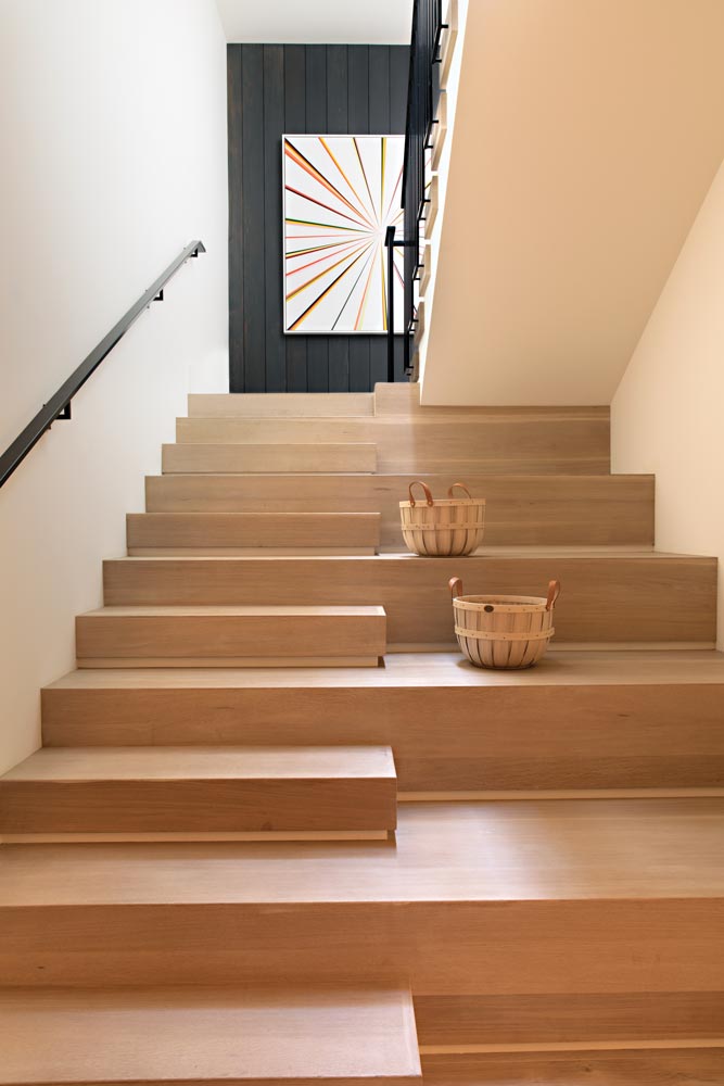
In this house, though—conceived as a place for not just one but two families to de-stress and decompress over holiday meals, parties and movie nights in the basement home theater—the emphasis is on restoration, and especially on remembrance of what brings us together. It’s why Olsen turned one of the house’s staircases into a cozy, kid-size nook by extending the width of the stair steps, creating seating areas just big enough for two cousins to escape and play a board game.
And it’s why, in the house’s other staircase, he carved out a tall window that’s aligned perfectly with a window just like it on the house next door. “It’s so that when the kids are going down the stairs in the opposite houses, they can see each other and wave to each other.” Bonesteel Trout Hall, bonesteeltrouthall.com; Eric Olsen, ericolsendesign.com
