Published as:
Past Present Future
Architecture: Gregory Phillips
Text: Carolyn Horwitz
Photography: Mel Yates
It’s no surprise that the British architect Gregory Phillips counts Carlo Scarpa among his heroes. Like the midcentury Italian master who intertwined modern and ancient to reactivate the architectural language of Venice, Phillips has made a practice of enhancing the historical homes of England with contemporary additions that both contrast with and celebrate the existing structures.
A recent Phillips project in Sevenoaks, Kent, less than an hour by train from central London, is a journey through time. Stroll from family room to bedroom to kitchen, and you’ll cross centuries: from a barn with elements believed to date back 500 years to a Georgian dwelling built in 1816 to an ultra-modern extension that unifies the disparate parts and serves as the heart of this present-day family estate.
Situated on 69 acres of land with a private 18-hole golf course and an active population of wild deer, the home is designated Grade II on the National Heritage List for England. This means that any changes that could affect the “historic interest” of the property must be approved by a planning authority—a process that might be considered a point of civic pride. “If you own a listed building in the UK, you’re seen as a custodian of the building for the future,” Phillips explains. “Although you own it, your job is to retain the heritage for the nation.”
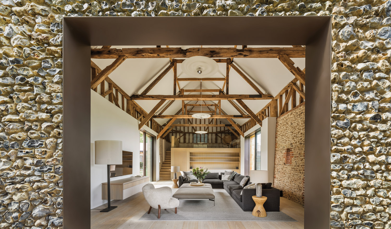
Phillips’ interventions included the restoration of the 1816 home; the repurposing of the much older, flint-and-brick barn to serve as an open family room; and the design and construction of the contemporary kitchen and dining area that now connects them. The latter was approved on the basis of replacing a previous, “very ugly” modern addition.
Now, that corner of the property is a glass-enclosed rectilinear volume, lined in elegant bronze cladding, that offers a glimpse of an interior courtyard garden as well as the finest views of the vast surrounding estate. “This relatively small addition connects two external spaces and two different architectures and forms something of, I hope, some 21st–century representation of what we can do now,” Phillips says. “So it’s kind of a linchpin—it’s the bit that draws it all together.”
Single-story and intentionally low-key, the addition harmonizes proportionally with the pre-existing structures and enables multiple juxtapositions. A series of exterior grassy steps with metal risers merges indoors and out; from inside, the steps can’t be seen, creating the illusion that the landscape comes right up to the double-glazed glass. Meanwhile, what was once the barn’s flint facade is now an interior surface, abutted by the contrasting expanse of smooth glass, which was recessed laterally into the stone wall to create a seamless transition.
As the architect points out, the introduction of communal cooking and eating spaces can “quietly” revolutionize grand English homes, which historically had uninviting kitchens used only by servants. In this house, the kitchen is a welcoming gathering place that satisfies the clients’ brief for furnishings that are modern but not glossy or showy. The neutral palette and natural materials create an aesthetic that is “quite pared-back and just homey,” says Phillips, whose firm oversaw the interior design and landscaping, as well as the architecture. Everything—from the matte-painted cabinetry and kitchen island unit by Plain English to the leather lounge chairs and oak dining chairs by Carl Hansen—has a soothing Scandinavian vibe. White, oiled-finish, wide-board oak flooring from Dinesen was used here as in most of the house, selected for its organic look that complements both the new and the old architecture.
In what was once the barn, which retains its original roof structure, the same white wood was used for bespoke cabinetry, alongside sofas by B&B Italia and a fuzzy lounge chair designed in 1938 by Denmark’s Viggo Boesen, sourced from &Tradition. In a nearby study, a bit more luxury enters the mix via walnut paneling and a pair of leather-upholstered Finn Juhl 45 armchairs placed before a fireplace with a blue limestone surround.
The sheltered courtyard at the center of the house is a contemplative sanctuary of trees, water features, and seating and dining areas. It’s accessed by what’s known as the garden room, a calming, sun-washed space with simple Nordic decor in natural woods and fibers, such as Space Copenhagen’s Fly sofa. The herringbone terra-cotta floor creates textural contrast and fosters the indoor-outdoor interaction.
While there’s no artwork to be seen yet, the tactility of these rooms, the multiplicity of finishes and eras, and of course, the pervasive views to the outdoors, lend the interiors a vivid expressiveness. The owners, Phillips says, are “quite happy to look at empty walls for a while,” a marked stylistic difference between his UK and US clients. (He’s at work on California homes in Malibu and the Hollywood Hills.) While the Americans are all about entertaining and flash— “people coming and seeing what you’ve got,” as he describes it—the Brits focus on personal comfort. “It’s more about, ‘I’ll just enjoy what I’ve got; I don’t have to tell everyone else about it.’” In any event, he adds, “with a house that has developed over hundreds of years, spending a few years building up your art collection is fine.” Gregory Phillips Architects, gregoryphillips.com
Save
Save
Save


