Published as:
SOUTHERN
COMFORT
Architecture: Harrison Design
Interior Design: Tish Mills
Text: Carolyn Horwitz
Photography: Chris Little

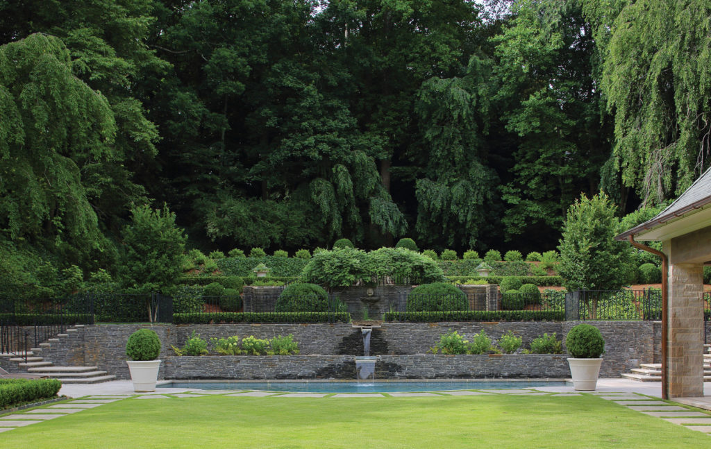
The way things have been going, it might be a good time to reconsider the keeping room. In colonial America, this area adjacent to the kitchen was where the family would gather to keep warm; these days, the keeping room, which has become a staple of Southern living, is a casual space to hang out with a drink and keep the cook company. At a home in Atlanta’s Buckhead neighborhood, the keeping room is one of many inviting elements that convey a rich blend of historic and contemporary influences. While the house—designed in the French country style by architects Harrison Design and constructed by McGarrity-Garcia—was built from the ground up, the lot it’s on boasts a serious pedigree. Its centerpiece is formal gardens designed in the 1930s by Philip Shutze, Atlanta’s most revered neoclassical architect and the force behind the city’s quintessential historic mansion, the Swan House.
At the new home, built for a couple and four children, the architecture and interiors were designed not only to maximize enjoyment of those exquisite gardens but to harmonize stylistically with them and with the venerable character of the neighborhood as a whole.
“It was 100 percent the goal for the house to look like it had always been there,” says Tish Mills, whose firm Harmonious Living created the interior design. That meant constant references to and interaction with the illustrious setting, most prominently via large-scale, floor-to-ceiling windows in most of the public spaces. The idea with the interiors, Mills says, was that they would be “in concert with the outside, so that you flow in and out emotionally really easily.”
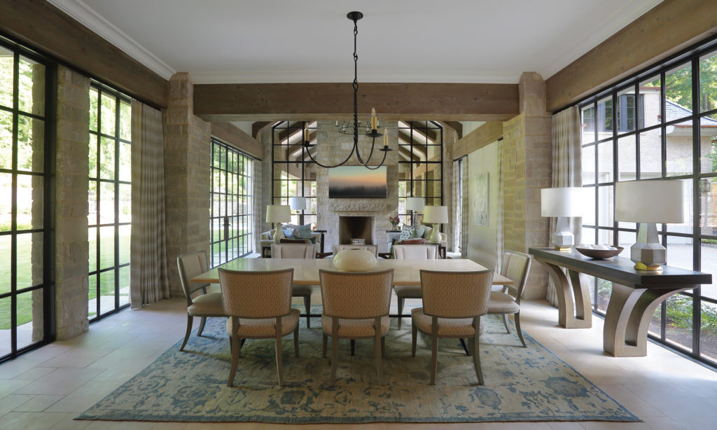
Take that keeping room. It’s part of a contiguous space that starts in the kitchen and also encompasses a dining area. The Indiana limestone walls give the impression that an outdoor space has been enclosed. This entire area, which spills outside to a covered terrace, is unified by uninterrupted limestone flooring and wood ceiling beams. The palette is intentionally neutral so as not to distract from the setting, with the few colors on display pulled in from the gardens. (Mills’ brief was to introduce subtle visual interest without being jarring, to “create an envelope that’s really quiet.”) Adding to that effect are chamfered cabinets and the oven hood, which is simple framed drywall covered in plaster to blend in with the walls. Handblown glass lighting bring a soft contemporary touch, while the pocket doors are modified antiques. “I love this kitchen,” Mills says. “It’s going to stand the test of time.”
Almost every room features a vintage or classically inspired item. “The few antiques, the few more traditional pieces, and some of the custom pieces that we had made were the things that bridged the gap between the architecture and the interiors that [the clients] really liked, which were much cleaner,” Mills notes. Such a transition can be seen when passing from the classically paneled entry to the minimalist main living room, which has views through a window wall all the way to the back of the garden.
The seating—Ferrell Mittman’s Norman sofas and Scalamandré’s Brentwood armchairs—is arranged in an unconventional way to wrap the corners of the room; this creates flexibility that makes the space conducive to everything from reading alone to a tête-à-tête to a large party. Anchoring this pristine white room on either side are America Martin’s painting Woman with Blue Towel, which lends a soulful, organic quality to the crispness, and Formations’ Soleil convex mirror, which picks up on the shape of the spherical formal boxwoods outside. Through the fireplace, a little surprise: a cunning slit in the herringbone masonry allows the flames to be glimpsed from the adjacent room, an intimate nook where the homeowners can escape with a glass of wine in a pair of Mattaliano’s Petite Dupre Lafon armchairs. That slit, an early innovation by architect William Harrison, “sums up the house,” Mills says. “It’s very traditional in its approach but very unexpected in its execution.”
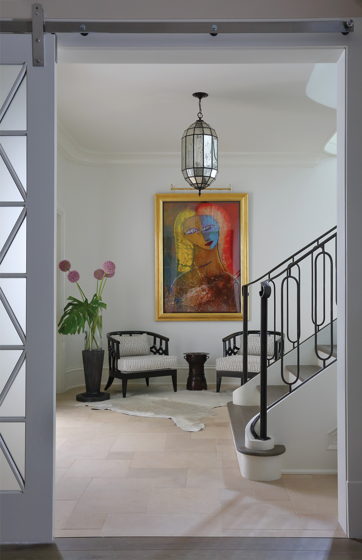
Connecting the home’s three floors is a winding staircase, whose iron rail, with its clean rounded lines, was designed to echo the curves and swoops of the stairwell’s architecture. At the bottom, a primary-colored painting by Jamali lends expressiveness to a placid seating area. Geometric precision can also be seen in the master suite, where the marble-encased bathroom is lined by a custom inlay mosaic rug whose hexagonal shapes are mimicked in the shower floor. It’s the type of detail that embodies the home’s sophisticated harmony, a tranquility that Mills, who has studied feng shui, brings to all her projects. “I make sure that everything I do is balanced,” she says. “I just consider it part of my entry point for a job, that it’s balanced, and it feels good. Because there’s so much going on in the world, and your house is your haven.” Tish Mills, Harmonious Living, harmoniousliving.net; Harrison Design, harrisondesign.com


