Published as:
The Long View
Interior Design: Douglas Wittels
Text: Heather Corcoran
Photography: Bill Timmerman
Every so often, a house is so tuned in to its surroundings that the interplay between nature and the built environment achieves something far greater than their sum. That special alchemy requires a particular type of thinking—and a spectacular site, no doubt—to realize a structure not just inspired by the Earth, but actually of the landscape itself.
In Scottsdale, Arizona, a rugged property at the foot of Pinnacle Peak provided just the canvas for architect Jack DeBartolo 3 and interior designer Douglas Wittels to conjure that magical effect. Dubbed Desert Platform House, the structure was designed as two planes DeBartolo describes as “surgically inserted” into the desert floor, following the slope of the Sonoran topography and surrounded by boulders and native saguaros and mesquites in a landscape by Indigenous Minds. In every direction, layered vistas roll out, framed by a palette of glass, mill-finished steel and custom-color masonry block sandblasted to “be compassionate” with the color of the mountain. “The desert is very abstract, vast and horizontal,” DeBartolo says, and the home’s sleek, low profile echoes classic desert modernism. The result, though “more restrained,” the architect says, is not without precedent. “I believe strongly that these are rooted materials,” he notes.
Near the main entrance, a row of Donald Judd–inspired window boxes leads to the home’s outermost layer, a copper sunscreen with an abstract pattern derived from a photograph of the desert floor. As the sun arcs through the Arizona sky, it casts light and shadow across the white terrazzo floor to the core of the house—an effect that surprised even the design team with its beauty. But as much as the home looks in on itself, it’s also in direct dialogue with the land around it, with postcard views through welded-in-place windows.
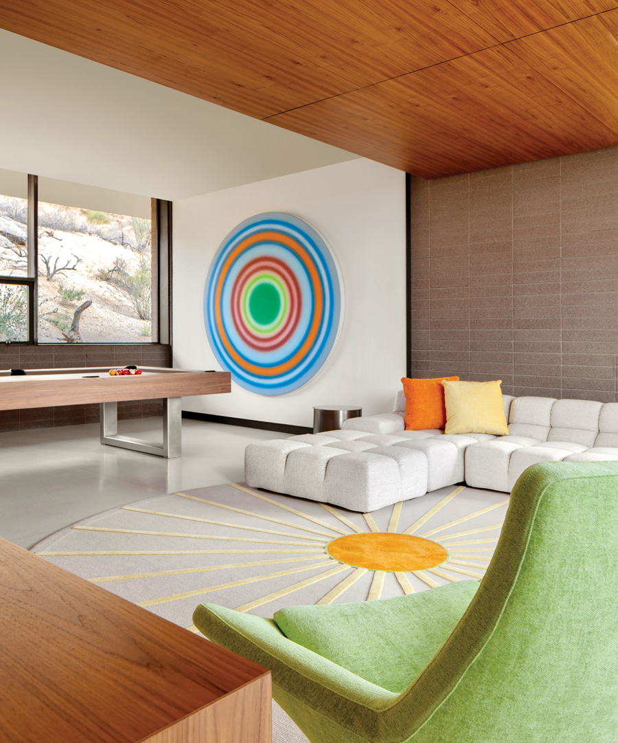
For designer Douglas Wittels—who has collaborated with the clients, an adventurous, art-collecting couple with two grown children, for more than two decades—the interior design scheme echoed the main motives of the architectural plan: “There are sightlines; in every space, you see into the next room, a progression into the next space,” Wittels says of the “unfolding design process.” To keep things visually coherent, he honed in on “one signature, one story” that links the rooms together. So he focused on an edited approach and continuity of scale—not only are all the furniture pieces designed to seemingly float above the floor, all of the seats and backs were specified at the same height. This strategy is reflected on a smaller scale within each space, as in the entertainment room, where American walnut on the ceiling creates a cozy cocoon, just one way wood is used to define volumes throughout the house. There, a low-slung B&B Italia sofa sits on a custom round rug with sunburst pattern designed by Wittels that speaks to the round Ugo Rondinone canvas hanging above a drum table from Brueton with a custom-color top to catch the eye.
Throughout the home, a restrained neutral palette acts as a foil to other “hot” accents in coral, vibrant yellow and green, a palette plucked from the sunsets, Wittels says. “When you’re lucky enough to have one of those incredible sunsets, if you’re standing in the living room seeing those three colors in the sky…it’s something absolutely magical.”
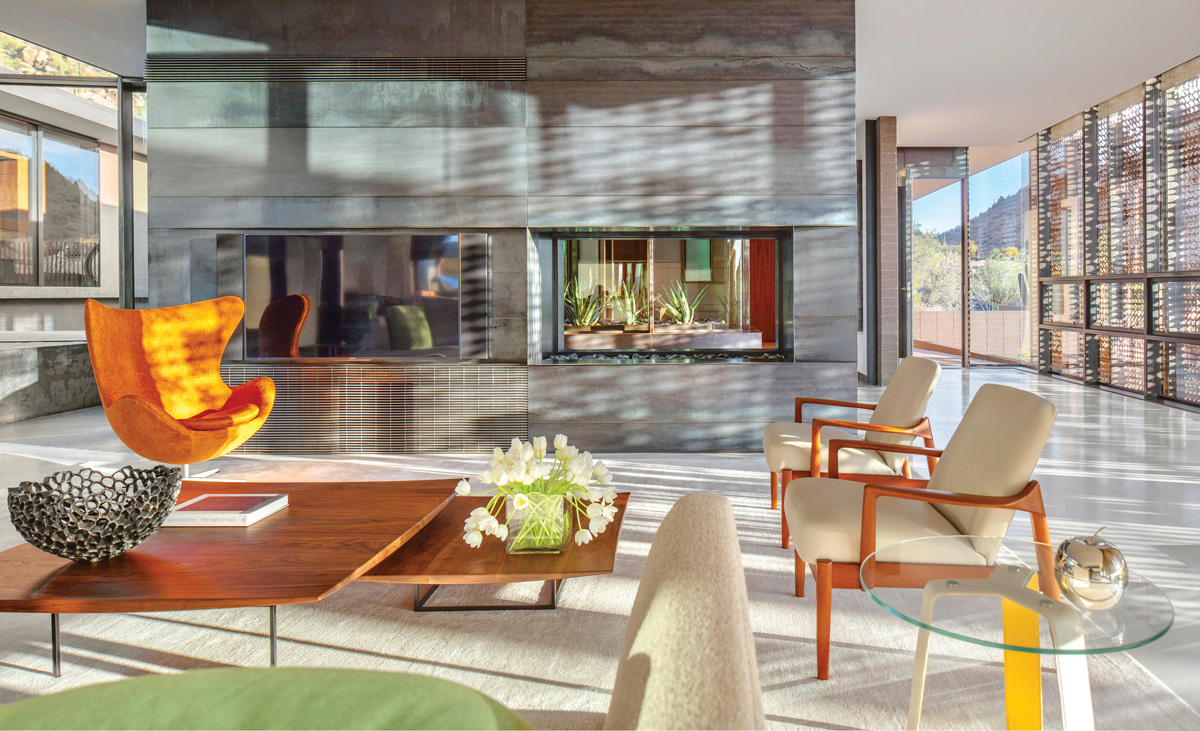
Just as the architecture recalls the history of modernism, Wittels too reached to midcentury icons when furnishing the house: a trio of Hans Wegner Shell chairs in pistachio Kravet fabric in the glass-framed galley, an Arne Jacobsen Egg chair in a bright orange textile from Osborne & Little in the living room, rattan Mies van der Rohe dining chairs. These classics are reinvigorated by contemporary touches, as in the circular steel-and-marble coffee table from Dennis Miller Associates topped by a Kristina Riska basket in the gallery. In the living room, a custom sofa of Wittels’ design rests on brushed steel legs near a double-sided Isokern fireplace. Nearby, a pair of 1950s teak France & Son armchairs upholstered in vinyl from Kravet sit beside walnut-and-steel nesting tables. “The intent wasn’t to create a period-specific space,” Wittels says. “The intent was to create a space that was very reflective of the time that we’re in today.”
Tucked in a far corner of the home, the main bedroom is a wood-lined sanctuary with a platform bed outfitted in custom bedding, including pillows with a sunburst pattern Wittels designed. The creamy Stark carpet below recalls sandy soil, while an ivory leather Eames lounge chair offers a perch to enjoy the rolling clouds beneath a contemporary abstract painting by Friedrich Kunath. Atop an integrated nightstand next to the bed, a resin sculpture by Ray Geary recalls the home’s thesis statement with its playful take on transparency. But it offers merely a hint of the room’s most exceptional layering act. Looking out the wide windows toward Pinnacle Peak, a corner slice at the top of the garage (ceiling included) was replaced by a custom window—an architectural homage to the beauty of the Sonoran Desert that allows for an uninterrupted view to the mountain. “We love when architecture doesn’t come on like a foreign body, but as an instrument,” DeBartolo says. “You almost understand the desert better because of the house.” Douglas Wittels, douglaswittels.com; DeBartolo Architects, debartoloarchitects.com
Save
Save
Save


