 Published as:
DIVINE
SYMMETRY
Photography: Karyn Millet
The old house in the Los Angeles neighborhood affectionately known by insiders as “Little Holmby” had been demo’d and new plans drawn by architect Richard Manion for a classic revival style house when Kara Smith of SFA Design signed on for the interiors. For the clients, a couple with two young children, Smith was poised to make the classical footprint sing in a modern way. “Since they’re a young family and passionate art collectors, we detailed the interiors in fresh and vibrant ways that showcase their growing collection while being chic and family-friendly,” Smith says. For this family, that meant shaking up the classical DNA, but retaining the highest level of customization. “We developed custom millwork and moldings, modern plaster ceiling and wall finishes, curated a combination of vintage and artisan lighting fixtures, concealed TVs in cabinetry with lifts and integrated mirrors, and created custom-designed furniture pieces for every room of the house.”
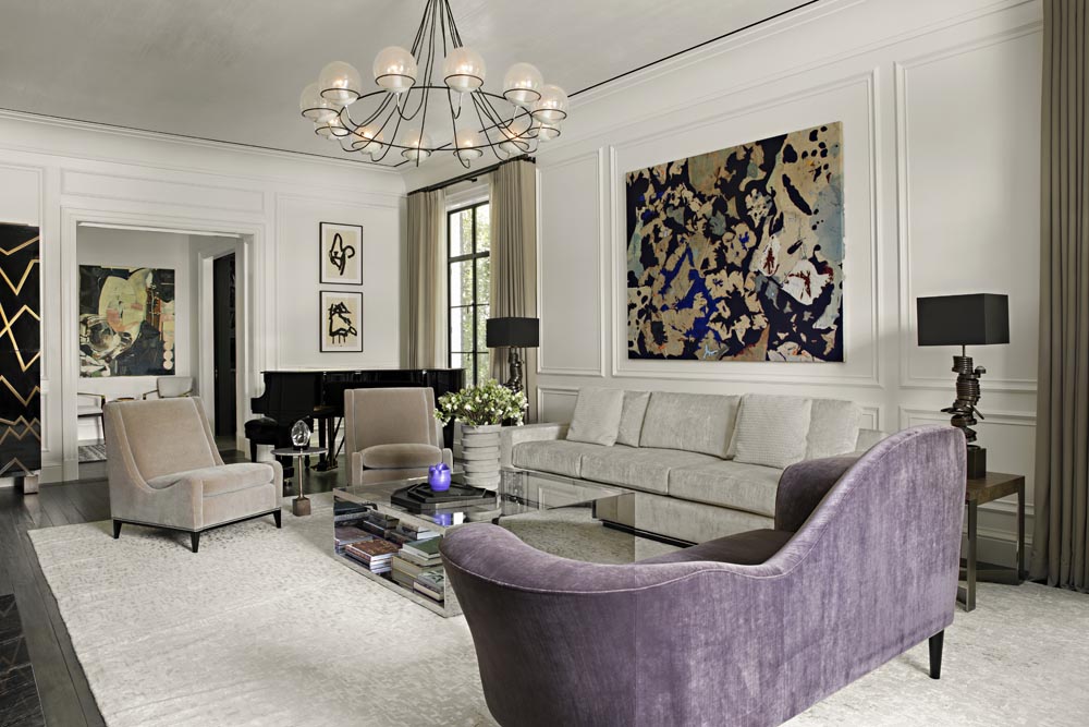
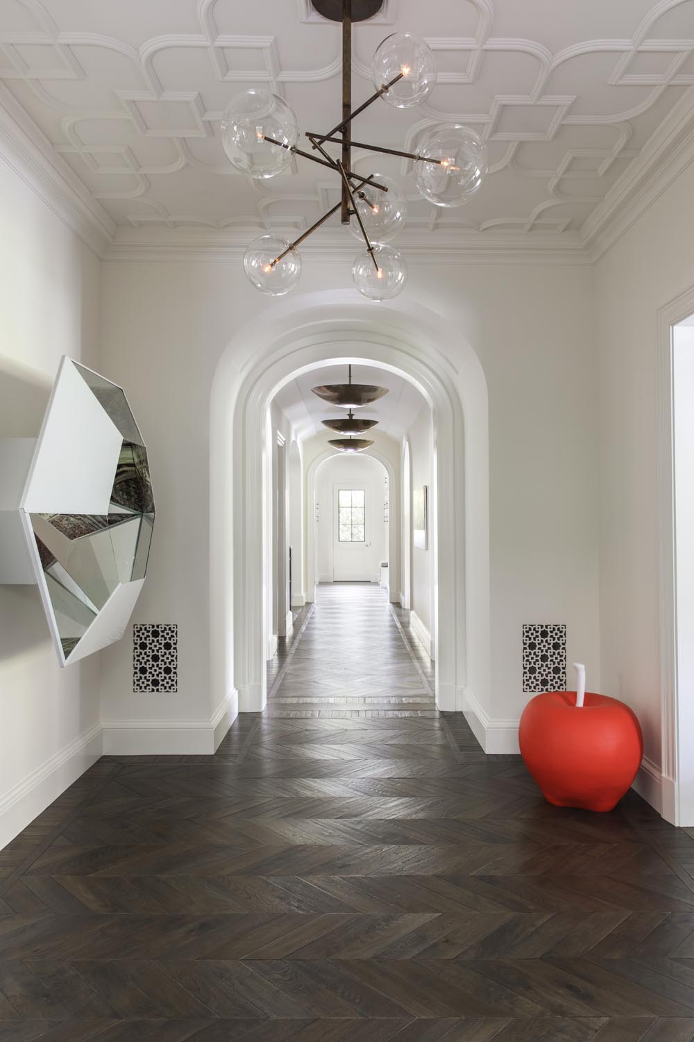
Smith and the clients worked with art consultant Lauri Firstenberg to integrate existing art as well as introduce new pieces as the opportunities arose—which was often. “There were some pieces to work around,” notes Smith. “We were able to collaborate with Lauri and the client on how best to showcase their selections, all while being mindful of what pieces related based on artist and subject matter. In the living room, Cartography #7, a mixed media piece by Samantha Thomas made up of linen, thread and acrylic on canvas seems to nod to the depth of materials Smith used in the design. It doesn’t dominate, interfere or “match” the décor, but complements the bold lines of the A. Rudin sofa just beneath it, and the vintage chandelier found on 1stdibs just above. Nearby, Robert Motherwell lithographs embolden, well, everything, and encourage the free, rambling curves of a settee covered in an Empire Grape Mark Alexander velvet from Thomas Lavin. In one hallway, the classical meets modern rises to a lovely crescendo, where a hall framed by Manion’s tailored arches is punctuated by a large red painted ceramic and wood apple by artist Math Bass occupying a corner; opposite is Doug Aitken’s hexagonal mirrored sculpture Glass Horizon.
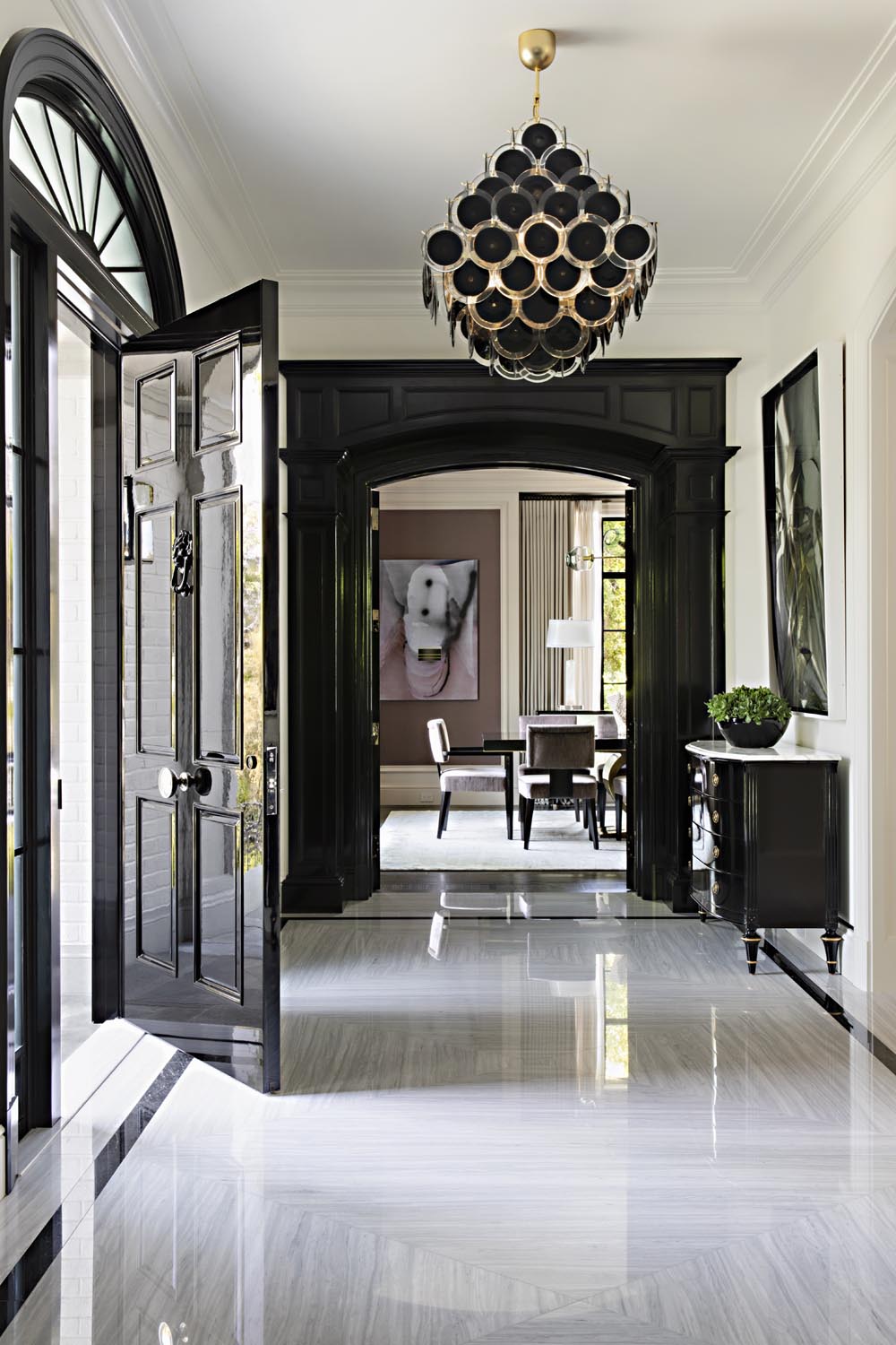 We wanted to establish drama,” Smith says, “so we created grand cased openings with classic entablatures to the living and dining room and painted them glossy black to give them a more modern edge. We designed a modern mitered patterned marble floor to update the traditional character.” A space tucked beneath the stairs in one hall would have made a lovely enough wine room, but better suited to the family was a secret hideaway. “We decided to make it more family oriented and created a nook where they could come in, sit down and take off their shoes, or perhaps have a quiet spot for reading,” Smith says. The back cushions, hung by oversize rings from the wall, are more art than furniture.
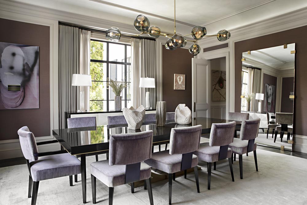
Where spaces called for more formality, Smith played with color, pattern and texture. “The key to balancing formal and casual was a continuity of backgrounds,” Smith says. “We used the same color floor everywhere but changed floor patterns, differentiating the spaces but still tying them together. Because the dining room tends to be more formal and leans toward an evening space, we chose a deeper color to give it its own identity. In the formal living room, we chose full-height paneled walls, and in the family room we moved to a paneled wainscoting in a dark shade with plastered walls above, pulling the thread of classic millwork in two fresh ways. The goal was to create a house with substance, so layering luxurious materials was forefront throughout, both with architectural materials and materials selected for furniture. The layering of these materials is what gives the house its status and elevated feel.”
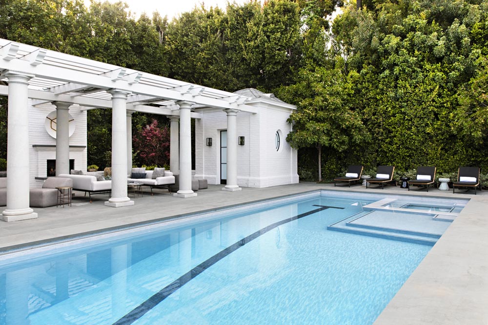
No classical house is complete without a proper columned loggia, but this one is modernized with a Lawson-Fenning sofa with throw pillows covered in fabrics from Holly Hunt and Janus et Cie, and sleek lounge chairs and tables from Mass Beverly. At its center, on axis with a little oculus window embedded in the pediment atop the rear facade is an untitled steel and bronze shield made by artist Anthony James in 2016. “The integration of outdoor space was definitely family driven,” Smith says. “The client wanted a space to host their children’s friends and those friend’s families. This is why we left a large lawn space and lounge area. We were also trying to create a classic symmetrical layout that suited the house, but with interesting art moments such as the art above the fireplace.”
“Our fingerprint is on every square inch of this house,” Smith continues. “We took Richard Manion’s base floor plan and just enhanced and developed every architectural detail. We based the concept on a classic traditional revival home, updated for a young modern family.” SFA, sfadesign.com; Richard Manion, richardmanion.com